A crop party is a modern quilting bee. A group of friends gather to have girl friend time, sharing joys and sorrows while preserving memories and creating a special keepsake.
Showing posts with label coloring. Show all posts

Sunday, August 24, 2025

Luna the Christmas Kitten


When I saw this week's sketch on Sunday Stamps Challenge titled "Put a Bow On It" I envisioned a card that resembles a  wrapped gift tied with ribbon and a tag.   


This seems to be vintage week because the Jingle Belles Challenge theme is "The Spirit of Christmas Past" and the Peace on Earth Challenge, an anything goes challenge, has this mood board:


Because the As You Like It Challenge question is "What is your favorite coloring medium and why," the tag needed to have a colored stamp  The four challenges provided the parameters for my card:  A card that looks like a wrapped package with a colored stamp and a vintage feel.  

The Christmas Kitten from Stampendous not only fits the vibe, it is my favorite cat stamp because Luna, who was adopted when she was a year old, may have looked like this kitten when she, herself, was a kitten (except for the white paws).  Luna, who will be 19 in September based on her estimated birthday when she was rescued, prefers that I post this picture that shows her in her prime.


I stamped the kitten with Stampin' Up's Early Espresso ink and colored her with my go-to Prismacolors.   I love them because they are flexible and forgiving.  You can show pencil strokes or blend them using a blending pencil.  You can also use the blending pencil to blend out color so there is no edge.  That is how I created dimension on the naughty kitty on this card.  My favorite way to use them is to layer colors so that the colors below show through colors in the layers above as I did with Sherlock on this card.  I like the softness you can get with good quality pencils.  Also if you make a mistake or apply too much color you can pick it up with a Prismacolor eraser.  Try doing that with alcohol or watercolor markers.  

For the gift wrapping I used an old patterned paper from DCWV.  The pattern looks like it could have been drawn with colored pencils and has a vintage look that compliments the tag.  This card is 5x6.5 to accommodate that tag.

Thank you for stopping by!  Until next time. Hansi


Wednesday, August 13, 2025

Grey Birthday Cats on Pink


The Word Power Challenge is a new challenge for me.  It is an "anything goes" one as long as the main focus is on the sentiment.  Did I mention that the Cut It Up challenge is to add a sentiment and I needed a birthday card?  The Color Hues challenge is to use pink and grey. so  now I had my concept.  

First things first: a background.  I went though my stash and found a pink one that I made using pink re-inkers to watercolor and stashed away because I wasn't happy with it and didn't have time to deal with it.  Now was time to try to salvage it.  I added some large splatters and let them run and dry naturally.  I liked it much better except for the center.  A birthday die from CZ Design cut from silver foil along with the shadow in vellum would disguise it.  Silver is grey, isn't it?  I used the Sacred Spells text stamp from Lavinia and a curly corner stamp by Inkadinkado with Shadow Grey Archival and Gina K Medium Carnation inks to lightly random stamp the background.  I wanted something to dress up the sentiment.  When in doubt, try a cat.  One of my favorite cat dies is Impression Obsession's cat set which cuts six small cats in different poses.  I have never cut the dies apart for fear of losing one, so every time I use it I have extras for my stash ready to go.  I picked out two in grey and used Prismacolor pencils to shade and give them dimension.  This was a challenge because my pointy eared darlings have long hair and manes, so you really don't see their bodies.  I swiped more grey ink along the edges, put everything together, and my card was done, or so I thought.  The silver sentiment outshoned the cats!  As Luna and Calli informed me, "That. Will. Not. Do."  I cut a second "it's your birthday" in white and carefully glued it over the silver.  Much better!  I also plan to enter this in the Show Us Your Pussycats Challenge.

Thank you for stopping by!  Until next time, Hansi


Monday, January 23, 2023

Enjoying Snow From the Warm Side of the Window


The Inspiration Station Challenge prompt for January is this photo:


The cat, of course, caught my eye as did the fact he is on the warm side of the window which is the only way my pointy eared darlings experience snow.  The other element that attracted me was that this is not a photo, but a piece of art with texture from brush strokes and layers of color.  I knew at once that I would use my Prismacolor pencils, my Poppy Stamps window die, a cat die (I have a few), and the Pine Trees 3D Shading stamp from Spellbinders that I think I bought right before the Pandemic.  

I stamped the trees with light gray ink and colored over them with my pencils.  I applied a little Stickles on the tops of the branches which shows up yellow in this picture. I used an Impression Obsession die to cut the cats three times each, stacked them, used dark gray and black pencils to create contours, and then applied a layer of Glossy Accents over them.  I cut three windows and stacked them with a piece of acetate between the bottom and middle layers.  The background panel was cut using a stitched nesting frame from Penny Black.  I cut the stamped trees down to fit behind the window and attached the cats to the front.  I tucked a piece of thin foam tape between the upper part of each cat and the acetate to level it up to the lower portion that was attached to the window sill.  The sentiment comes from Gina K Designs' Sparkling Snowflakes set.

In addition to the Inspiration Station challenge, I plan to enter this card in the Retro Rubber "Winter Scenes", Cut It Up "Anything Goes", and Crazy for Cats "Anything CAT Goes" challenges.  Thank you for stopping by,  Hansi


Thursday, April 22, 2021

Birthday Card for a Beachy Friend


Growing up on the corner of the Chesapeake Bay and the Atlantic Ocean virtually guaranteed that the beach would be in my DNA which means I love Stampin' Up's Sand and Sea suite.  The Seaside Seashell die set not only coordinates with the stamp set, but with the Seashells embossing folder as well!  You can either line up an embossed panel with the die and cut or you can cut first and line up the die cut in the embossing folder.  I tried it both ways and found the later was easier to line up and seemed to result in a deeper impression.  

Now, I have a dear friend and sister paper crafter who, despite growing up in the Midwest, loves the ocean, so you know I had to use this set to make her birthday card.   I wanted to use the Fab Friday Sketch below, so I cut the embossed die cut apart and colored the pieces with Prismacoler pencils. 


I then arranged them across the front panel which was embossed using the Sea Bed folder to form the element that goes across.  I used a stamp from the Itty Bitty Birthday Greetings to make a sentiment piece and put it more or less in the middle.  The bottom right shell is popped up with foam tape to add dimension.

I also plan to enter this card in the Crafty Catz Challenge which is anything goes with the optional twist of embossing and the Addicted to Stamps and More Birthday Card Challenge.   Thank you for stopping by!  Until next time, Hansi


Monday, September 21, 2020

"Stained Glass" Snowflake


I saw this Jennifer McGuire video last year and finally got around to trying the technique for the Jingle Belles' Heavy Metal/ Baby It's Gold Outside challenge. and the Die Cut Divas' Holiday challenge.  If you don't have time for a video, I will try to explain what I did.  First I used a Stick It adhesive sheet to back a sheet of heavy white cardstock and cut five die cuts using the Spellbinders Snowflake Snippets die.  I also cut a square the size of the die cuts from heavy cardstock without Stick It for a base.  Using Stick It or another type of two sided adhesive sheet makes it a lot easier to "glue" the die cuts together.  I attached one die cut to the square and then colored in the spaces with my Zig Clean Color Real Brush markers followed by a shimmer brush.  Next I stacked on three more of the die cuts and applied Glossy Accents in the spaces.  The goal is not to completely fill the wells, but to make sure you have a generous amount that gets into all the nooks and crannies.   I used a toothpick to pull it into the tight corners.  While the Glossy Accents dried I coated the last die cut with Versamark and heat embossed it using Ranger superfine silver embossing powder.  I did this a total of three times.  I then stamped and heat embossed the sentiment on the card front after laying the embossed die cut on it to check the placement.  After waiting a few hours for the glossy accents to thoroughly dry I attached the embossed die cut on top to make it look like stained glass and used a liquid adhesive to attached it to the card panel.

A few thoughts:  The stacked die cuts really do look like stained glass giving it a definite wow factor.  This is not a card I would send to just anybody and nor does it lend itself to mass production.  It it is quite thick and should be mailed in a padded envelope.

I will also be entering this in the Crafty Hazelnuts Christmas Challenge which is a new one for me.  Thank you for stopping by!  Until next time, Hansi

Thursday, September 17, 2020

Welcoming a Long Awaited Baby


The theme of the current Daring Cardmakers Challenge is Oh Baby!  Oh baby is right!  After ten years of disappointment and heartbreak my cousin and his wife have had a beautiful baby girl.  Of course that calls for a gift accompanied by card.  I used an old Close to My Heart stamp and colored it with my Prismacolors.  Then I used stitched rectangle dies from Kat Scrappiness to cut around it and create a mat.  The sentiment was cut from metallic gold using a Simon Says Stamp die.  I like the softer finish.  Before mounting it to a pink background popped up with craft foam I cut the small heart from the part that won't show.  That way it matched perfectly.  The last step was to use a clear shimmer brush on the bow and heart.  Unfortunately it doesn't show in the photo.  Here is close up of the coloring:


I am a little nervous about sending this because the new mama is a professional artist.  Thank you for stopping by!  Until next time, Hansi


Wednesday, October 9, 2019

Naughty Kitty


There is a reason why we didn't have a Christmas tree last year.  I thought it would be safe to hang a few ornaments from the dining room light fixture; however, between the day after Thanksgiving and New Year's somebody grew.  If anyone knows how to share this with the motion on, please let me know.  She is jumping and the ornaments are swinging.  Needless to say, I had to take down the ornaments.


You know that when I saw that The Alphabet Challenge was "N is for Naughty" this incident and stamp came to mind.


This adorable stamp by Inkadinkado is perfect for a CAS card which aligns beautifully (purrfectly?) with the Addicted to CAS Challenge code word of creature and The Sweet Stampin' Challenge to feature an animal in honor of World Animal Day which was October 4th.  As you can see, if I placed the kitty where I wanted her to be in terms of composition, the branch would be at loose ends, so I used a journaling pen to extend the branch to the edge.  The sentiment is part of Hero Arts' Fluffy Stockings Stamp and Cut set.

Now to color the image.  I have never mastered alcohol pens, so I used my Prismacolor  pencils.  I recently discovered that they make a colorless blending pencil.  All I had to do was draw a heavy line of silver (I don't have a gray pencil) along the edge and then "color" with the colorless pencil in small circles to draw the color out into a fade.  I also used it to smooth away most of the pencil strokes after coloring the ornament.  I layered the panel on colored cardstock before attaching it to a card base because it needed the extra pop of a colored frame.  I hope it still qualifies as CAS.  In case you have noticed the sentiment in the completed card and the sample above are in different colors, I come from a family of crazy cat lovers, so I made several cards for Calli(sto) and her sister to send to their aunts and uncles.  Of course she had to supervise.


By the way, Calli is now 14 months old and is still naughty, although she prefers to say inquisitive or playful.


Thank you for stopping by!  Until next time, Hansi


Monday, September 16, 2019

Hanging Ornaments


The theme for the September Christmas at Sweet Stampin' challenge is Christmas decorations and this Freshly Made Sketch seemed perfect for it:


I decided to use a wide Merry Christmas sentiment to create the illusion of the strip across.  I used a die from Birch Press Design and stacked three cut from Stampin' Up Gorgeous Grape cardstock topped with one cut from Gold foil paper slightly offset.  This gave the sentiment lots of dimension.

Now for the ornaments!  I made them using the Simon Say Stamp "Ornate Ornaments" stamp and die set with Ranger Princess Gold embossing powder and colored them with a Violet Zig Clean Color Real Brush marker.  I simply swiped it across the embossing and blotted up any bits of ink that might have been on the embossing.  No need for detailed coloring when you are only using one color!  The original plan was to use gold embroidery thread to "hang" the ornaments and place it on a Gorgeous Grape card base, but as I laid everything out the card seemed pretty boring, so I used substituted black for those elements which gave it more pop.  I wish I had used regular sewing thread because the embroidery thread is somewhat fuzzy.  I had also planned to let the ornaments swing freely, but like so many plans, that needed to be revised as the bottom two ornaments kept switching places and the round one on top of the almond one did not look right.  After I glued them all down I realized I could have left the almond one loose like a tag.  Y'all may see another version of the hanging ornaments in the future.  I had to finish the front off with (what else?) bitty sparkles.  The folks at the Winter Wonderland Challenge blog want to see my favorite embellishment.  If you have been reading my blog for a while, you know that sparkles are my favorite!

Here is the inside using a sentiment from Close to My Heart's "To You and Yours" stamp set which I stamped with Black Versafine ink and embossed with clear detail powder.  No messy black embossing powder for me!


I also plan to enter this in the Simon Says Stamp Monday Monochromatic Challenge.  Thank you for stopping by!  Until next time, Hansi

Monday, June 3, 2019

Peek-a-boo Gull


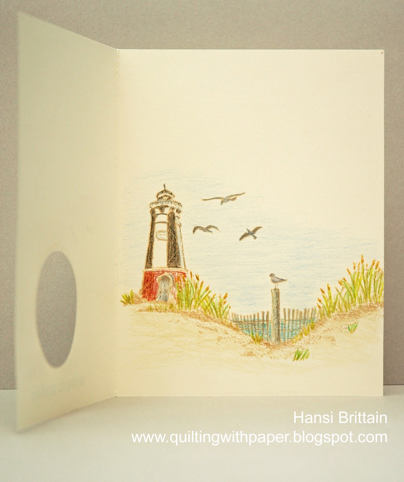
If CAS means lots of white space and minimal embellishments, this card would qualify, but I am not sure I can say simple because lining up the die to cut the window in the right place was fun and games.  I started with this Freshly Made Sketch:


I knew I wanted to make a summer themed card for the Paper Players Challenge, and I had just discovered the Daring Cardmakers intriguing challenge to create a secret hideaway for an element of your card.  I found myself thinking what if I made the circle on the sketch a window which only showed a hint of what was inside.  Some of y'all may know that I grew up where the Chesapeake Bay meets the Atlantic Ocean and have a thing for lighthouses, so this is what you see when you open the card.  


First I stamped the inside using Antique Linen Distress Oxide ink and Close to My Heart's Perfect Day and Seaside Greetings stamp sets.  Then I cut a window and stamped the front.  After coloring with Prismacolor pencils, I stamped the sentiment from Altenew's Quilted Elegance in Black Soot Distress Oxide Ink.  Then as I wrote the above sentence and looked at the sketch again I realized I had not noticed that it includes an element along the left edge, so I stamped the edge with Stampin' Up's Wood Background stamp and re-shot the photo.  Can I get this posted and linked in time?

Thank you for stopping by!  Until next time, Hansi

Friday, May 31, 2019

A Masculine Birthday Card


I don't know about y'all, but I always struggle with masculine cards.  Given that I do have males who happen to have birthdays in my life, I have to challenge myself each time I need one, so why not look to some of the challenge blogs for inspiration and motivation?  The Papercraft Challenge theme of "For Men and Boys" provided the motivation while Sunday Stamps provided inspiration with this photo and the challenge to use at least three of the colors to create a card.


The drawing in the book reminded me of Simon Says Stamp's Ornate Backgrounds stamp, so I stamped it on Desert Storm paper and embossed it with white powder.  I used ZIG Clean Color Real Brush markers to color the image, layering a medium gray and green to make that color to the far right which sometimes looks dark gray and sometimes muted dark green to me.  For the sentiment I combined the word happy from Simon Says Stamp's Stained Glass Love set with "birthday to you" from Birchpress Designs' Make a Statement set.  After trimming everything down I decided I wanted a thin border around it before putting it on the card base but didn't have colored cardstock to match the dark muted green, so I cut another piece of Desert Storm cardstock and colored around the edges in the same gray and green I used on the stamp.  Perfect match!  Then all I had to do was attach it to the card base popped up with craft foam and glue on few white Nuvo Drops.  Because it takes Nuvo Drops so long to harden, I drop a lot of drops in different sizes on a silicon mat, let them dry for a few days and then put them in small jars to use later.

I am also going to enter this into the Seize the Birthday challenge which is always anything goes with an optional topping which I will forgo as this week it is "presents."  By the way, although the Sunday Stamps challenge ends at 6:00 p.m. EDT, there is plenty of time to enter the other two if you are inspired to do so.  Thank you for stopping by!  Until next time, Hansi


Monday, April 1, 2019

In Memory of a Steel Magnolia


I made another version of this card for a friend whose mother passed.  It had just a hint of color on the flowers and a sentiment in a beautiful script.  It was really pretty, but no quite right.  You see, GrandBetty was what we in the south call an iron or steel magnolia:  a woman who is soft and sweet like a magnolia on the outside and strong as steel on the inside.  She was an artist who loved children, and she was never seen without her hair done.  When she could no longer leave her home, her angel of a hairstylist came to her home to make sure she was properly coiffed.  I have no idea what color her hair really was.  Yet she handled life's challenges, and there were a few, head on.  Of course she did so with dignity and grace.  No, I needed a different card for her to honor her.

The pink, delicate drawing, and sparkles keep it sweet, but the pink is brighter and I used bold stripes on the edge and a sentiment embossed on a black strip to provide contrast and better reflect who she was.  The layout is based on this Freshly Made Sketch:


The stamp is by Simon Says Stamp and I colored it with Prismacolor pencils.  I am much happier with this version.  Thank you for stopping by!  Until next time, Hansi

Monday, October 22, 2018

I'm Back!


Hi y'all!  Yes, I know it seems like I fell off the face of the earth.  It's not that I haven't been making cards; I just haven't had the time to photograph and post them.  It doesn't help that I have a new assistant.


My old assistant who acts more as a supervisor is not sure what she thinks of her new sister.  We don't usually adopt kittens; we adopt cats!  So this is a new experience for us, and it is a wonder I managed to complete this card at all!  

Now about the card:  It's time to crank out the Christmas cards, so I am starting with one based on this Freshly Made Sketch:


I embossed some ornaments from the Simon Says Stamps' Ornate Ornaments set in gold and colored them with Zig Clean Color Real Brush markers.  The "merry" sentiment is cut from gold foil paper using the Merry Sugar Script die from Birch Press Design.  The card panel was cut from a die set from Kat Scrappiness.com.  Here is the inside:


Please excuse the quality of these photographs.  I have a new computer and haven't loaded Photoshop which means instead of taking pictures with my good camera, I had to use my phone.  Thank you for stopping by!  Until next time, Hansi

Sunday, November 19, 2017

Sledding Squirrel


This is an under the wire entry in the Merry Monday Outdoor Activity challenge.  I stamped this squirrel by Inkadinkado with Chocolate, colored it with Prismacolor pencils and backed it with Mistletoe, a very old Close to My Heart paper.  In keeping with the vintage vibe I distressed the edges with chocolate ink.  The sentiment is popped up with foam tape to give the card some dimension.

Thank you for stopping by!  Until next time, Hansi

Wednesday, November 15, 2017

Kitty Decks the Halls


The Christmas Card Challenges inspiration picture features kitties.  Now I have loved cats all my life and have many stamps featuring them, but this is my favorite, perhaps because Luna, who was adopted as an adult, may have looked like this as a kitten (except for the white paws).


  I heat embossed her with Cocoa pigment ink and clear detail powder and then colored her with Prismacolor pencils.  I sponged the edges of all the light papers to age them in keeping with the vintage feel.  I popped her up with foam tape and embossed the sentiment in gold to give the card some dimension.  Here is the inside:


Thank you for stopping by!  Until next time, Hansi

Monday, November 13, 2017

Stained Glass Snowflake


Ever since I saw this video by Jennifer McGuire on what she calls a stained glass technique, I have been wanting to try it.  This Freshly Made Sketch seemed perfect one to try it on while test driving (stamping) my new Tim Holtz Swirly Snowflakes stamp and coordinating die sets.


Essentially you cut the shape and attach a stamped image that has been embossed on heat resistant acetate behind the opening.  This works best with a stamp that has lots of lines.  I will have to warn you about this die set:  There is no border, so positioning the stamped acetate behind the opening so it would line up was tricky.  I ended up lining it up and then holding it in place while I pulled back sections of the acetate and applied adhesive.  Next you put a colored version of the stamp behind the  opening separated by foam tape, so the embossed image floats above.  Jennifer used a sponge dauber to ink the solid layer of a multi-layered set for one set of cards and copic markers to color the image for another.   I used a light blue to stamp the snowflake on a piece of watercolor paper and painted it with Zig Clean Color Real Brush markers and a watercolor brush with water to spread the color.  I embossed the sentiment and added a lone sparkle to the middle of the snowflake.     Here is a close up shot at an angle to try to show how the embossed acetate snowflake is above the backing color:


Before I did all that, I had to make the background.  I wanted to keep the emphasis on the "stained glass window,"  so instead of using two papers, I used one color and embossed one piece to keep it subtle.  I adhered the two pieces on a piece of printer paper to hold them together because they were not going to be glued directly on the card base.

Thank you for stopping by!  Until next time, Hansi