A crop party is a modern quilting bee. A group of friends gather to have girl friend time, sharing joys and sorrows while preserving memories and creating a special keepsake.

Wednesday, July 31, 2013

A Little Art Deco to Color My Heart


This new Single "Snowflake" stamp, another goodie from Cheryl's open house, is just the stamp to use for the Color My Heart Color Dare to use Blush, Sorbet, and Gypsy.  You may notice that I have the word snowflake in quotation marks.  This is because I see this stamp more as an Art Deco tile.  No matter what you call it, I love this stamp and all its possibilities.  Today I stamped it and the sentiment with Slate pigment ink and clear embossed before coloring the "snowflake" with alcohol markers.  The panel is popped up with foam tape.  Please note that, unlike in my last post, I used some restraint with the sparkles, lol,  I am not sure if this is Gypsy paper.  When Close to My Heart had its 8.5 x 11 paper packs on clearance, I ordered a few, but am not sure of all the colors.  This one looks like what others are using for this dare, but then again, it might be Spring Iris.  Either way, it is the closest color paper that I have.  Here is the inside:


Like I said, I can see lots of possibilities for this stamp.  The layout is this week's Unscripted Sketch:


Thank you for stopping by!  Now please head on over the Color My Heart Color Dare and Unscripted Sketches to see what creations the others have come up with.  Until next time, Hansi
 
Materials used, all Close to My Heart unless otherwise noted:
Paper:  Sorbet, Blush, Slate, Gypsy (?,) and White Daisy cardstock
Ink:  Slate pigment and dye inks, Blush, Sorbet, and Gypsy alcohol markers
Stamps:  Avonlea Cardmaking Workshop (retired), Single Snowflake,
Embellishments:  Clear Sparkles, Silver Shimmer Trim, Clear Detail Powder
Other:  Paper Lace II embossing folder from Cuddlebug


Laughing Lola Goes Elegant in the Rose Garden


I was so excited to go to my consultant's open house to see the new Close to My Heart products with my own eyes!  I also came home with some goodies including a package of Laughing Lola paper.  Thank you, Cheryl!  As I played with Laughing Lola and the "G" key on the CTMH's Artiste Cricut cartridge for the current challenge in the Rose Blossom Garden, I found myself thinking that this bright somewhat edgy teenage girl paper can have an elegant side just like the grungy teenager who turns into Audrey Hepburn for the prom. 

While making this gift card holder I learned a few things:
1.  You can make a holder up to 5.25 inches if you press the "fill page" key, but the size that fits a gift card more closely is 4.75.
2.  When trying to determine the size to cut for the "accent 1" bow, allow for the curve.  The size you cut will be about 2.5 times the diameter you want your finished bow to be.  My first attempt I only doubled the diameter.
3.  Use the handle of your piercing tool or something similar to curl the spokes before you assemble your bow to avoid creasing.
4.  About the smallest you can make an "accent 1" bow is with a 4 inch cut.  Otherwise it flattens out when you bring the spokes to the center.
5.  If you want a border on you card, you are going to have to waste paper by cutting another card holder and then trimming off the part you want.  My one gripe with the Artiste cartridge is, unlike the Art Philosophy and other cartridges I have, there is a lack of layering options for each key.

For the bow I cut two "accent 1" pieces, one at 4.5 and one at 4.0 inches, stamped them, sponged the edges and curled them.  The directions show glue holding the spokes in the center, but I used a Bamboo brad on the larger bow and the large Rhinestone brad on the top one.  (Fortunately I have small fingers.)  Because I wanted a black border, I cut a 5.25 inch card holder, trimmed off one side and glued my assembled card holder to it.  You can see it here:


I think I used half a pack of Bitty Sparkles on the front to compliment the center of the bow.  I know Glitter Glitz would be a more cost effective option, but I just love the sparkles!  Thank you for stopping by!  Now please hop over to the  Rose Blossom Garden to see what others have created with the "G" key on the Artiste cartridge.  Until next time, Hansi

Materials used, all from Close to My Heart unless otherwise noted:
Paper:  Laughing Lola, Black and Colonial White cardstock
Ink:  Bamboo, Black
Stamps:  Card Chatter Birthday
Embellishments:  Rhinestone Designer brad (to be retired), Bamboo brad (to be retired), Bitty Sparkles

Sunday, July 28, 2013

Colorful Ombre With Heart


The last Heart 2 Heart challenge for July is to use the oh so trendy ombre technique.  This can be gradations of a single color from light to dark (or visa versa) or it can be multiple colors, usually ones that are adjacent to each other on a color wheel, blending into each other.  For this card I used Lagoon, Pacifica and Gypsy with a little bit of Outdoor Denim around the edges.  I prefer to use the round yellow sponges that you cut into quarters because I like the soft effect you can get with them.  The only problem is that my sponges tend to go missing.


To let the ombre technique shine, I decided to keep it fairly simple without layers or B&T paper.  On the inside of the card I used a stamp in the same colors:


This is my last week as guest designer For the Heart 2 Heart Challenge Blog.  It has been a real honor to "play with the big girls!"  Now please head on over and see what they and fellow CTMH fans have done with the ombre technique.  Thank you for stopping by!  Until next time, Hansi

Materials used, all from Close to My Heart unless otherwise noted:
Paper:  White Daisy cardstock
Ink:  Lagoon, Pacifica, Gypsy, Outdoor Denim
Stamps:  Eclectic Edges (retired), Sentiment from the Avonlea Cardmaking Workshop (retired)
Embellishments:  Pearl Flourish, Pearl Opaques, Pewter Mini Medley (to be retired July 31)


Friday, July 26, 2013

Unscripted Sketch 220


I made this card with one of my favorite retired papers, Sonoma, using this layout from Unscripted Sketches:


The sentiment panel is popped up with foam tape.  This card is not for anyone in particular, but every time I turn around there is someone in need of comfort who would use this card, so it never hurts to have one ready.  Thank you for stopping by!  Until next time, Hansi

Materials used, all from Close to My Heart unless otherwise noted:
Paper:  Sonoma (retired), Plum and Colonial White cardstock
Ink:  Olive
Stamp:  Be Still
Embellishments:  Purple Sparkles, Sonoma Assortment (retired), Sweet Leaf ribbon (retired)


Thursday, July 25, 2013

A Pull Tag Birthday Card for Freshly Made Sketches


This birthday card that I made using the Freshly Made Sketch below makes me think of fall which is appropriate for today as the temperature only made it to 82 rather than our usual 90 something.  Although many of y'all would not consider this fall weather, we do around here.  You really can't break out the sweaters until late October most years, but I digress... If you are wondering about the tag shown in the sketch, here it is:


 I first saw a version of the flower on Amie Kiger's blog, Mimi, Myself and I.  For my version, I used the Cricut Artiste cartridge from Close to my Heart to cut two flowers (accent three "f" key, page 54) at 2.5 inches and one each at 2.25, 2.0, 1.75 and 1.5 from Crème Brulee cardstock, sponged the edges heavily with Sunset, shaped the petals and stacked them using an Antique Copper Designer brad (soon to be retired).  I cut the leaves (shift accent 3 "2" key, page 32) at 1.5 (I think), in Olive, sponged them with Olive ink, curled them and attached them with foam tape.  Here is a close up:


The bee is from the Buzz and Bumble Assortment.  Because it blended too much with the background, I colored it with Sunset followed by Crème Brulee alcohol markers.  Here is the inside of the card:


The Freshly Made Sketch:


Thank you for stopping by!  Until next time, Hansi

Materials used, all Close to My Heart unless otherwise noted:
Paper:  Buzz and Bumble, Crème Brulee, Olive, Chocolate, and Colonial White cardstock
Ink:  Sunset, Olive and Chocolate plus Sunset and Crème Brulee alcohol markers
Stamps:  Joyful Birthday
Embellishments:  Décor Journaling Spot (retired), Antique Copper Brad (to be retired), Buzz and Bumble Assortment (to be retired)
Other:  Honeycomb embossing folder from Cuddlebug


Sunday, July 21, 2013

Take Me Home, Heart 2 Heart!


I now live a hundred miles up river, but home to me will always be the corner of the Chesapeake Bay and The Atlantic Ocean where the Cape Henry Lighthouses have been guiding sailors since the founding of our country.  This stamp from Close to My Heart's retired Perfect Day set has always reminded me of the Old Cape Henry Lighthouse.


When Haley told me that the theme of this week's Heart 2 Heart Challenge was going to be Water, Water, Everywhere, how could I not use this stamp?  I stamped it with Versamark, heat embossed it with Clear Detail powder and then sponged over it with Crystal Blue and Outdoor Denim to reveal the image.  The birds were stamped in second generation Outdoor Denim and the sentiment in Cocoa.  In order to accommodate the bulk of the hemp, I must have used half a roll of foam tape to pop up the background panel and the lighthouse panel.  The layout is an old one from Freshly Made Sketches.


Here is the inside: 


There is a new challenge in town, the Curtain Call Inspiration Challenge in which a challenge photo will be posted on the 1st and 15th of the month and you have ten days to complete it.  It just so happens that inaugural challenge is Feeling Nautical.  What can be more appropriate than the lighthouses which have warned and guided sailors through out history?  Can you tell I have a deep emotional connection to lighthouses?


So ends my fourth week as July's guest designer at Heart 2 Heart Challenges.  I have one more week to go and it is a challenge that is right up my alley!.  You will just have to come by and see what it is  In the meantime, thank you for stopping by!  Now please hop on over to see all the creations inspired by water.  Until next time, Hansi

Materials used, all Close to My Heart unless otherwise noted:
Paper: Majestic Blue (retired), Bamboo and White Daisy cardstock
Ink: Crystal Blue, Outdoor Denim and Cocoa
Stamps:  Perfect Day (retired)
Embellishments:  Natural Hemp, Filigree Charms, Clear Detail embossing powder


Friday, July 19, 2013

Living for Today at Unscripted Sketches


I love Close to My Heart's Love Doily stamp and knew the minute I saw this week's  Unscripted Sketch that I was going to use it.


Amie Kigz has inspired me to try it in different colors.  This is a card she did earlier in the week and I didn't mean to case it so closely.  I wanted to use this sentiment and For Always paper and Ruby or Cranberry seemed the most logical pop color and... 


I am loving CTMH's pigment inks with clear detail embossing powder.  I used them on both the sentiment and the doily. I used foam tape to pop up the sentiment panel.  Here is the inside:


Thank you for stopping by!  Until next time, Hansi
 
Materials used, all Close to My Heart unless otherwise noted:
Paper:  For Always, Ruby, Black and White Daisy cardstock
Ink:  Black and Ruby pigment
Stamps:  Love Doily, The Present (retired)
Embellishments:  Pink Glitter Gems, Clear Detail embossing powder


Monday, July 15, 2013

Screaming for Ice Cream With Heart 2 Heart


If you are looking for my entry in the Rose Blossom Garden challenge, please scroll down to the next post or click here.  I made a mistake when linking it.  Thank you.


I am in my third week as guest designer at Heart 2 Heart Challenges and the theme this week is Scream for Ice Cream, one of my favorite foods.  I am glad Haley gave me the list of challenges at the beginning of the month because, having no ice creamy stamps or Cricut shapes, it took me a while to come up with my concept.  This week's Freshly Made Sketch provided the perfect layout.


How did I make that cone?  I started by punching a 2.5 inch circle and scoring it in a cross hatch pattern.  Then I rolled it into a cone, pinched the sides to make a crease where it would stick out from the card, trimmed the excess from the back leaving enough of a tab to glue it to the background.  Before attaching it I trimmed the top to make it a little less round.  The "ice cream" is Colonial White Rosette Ribbon that I cut into separate rosettes and attached with liquid glass.  That was when I spotted a problem.  The "ice cream" was blending too much with the background thanks to two areas of Colonial White, so I carefully pieced in some color cut from scraps to help it show.


What do I want the recipient of this card to have a day full off?


I put a few slivers cut from scraps to make the holes in the letters green.  By the way, this is one of those papers that has some colors unique to it, but I found Juniper ink was a close match for stamping.  As I said in the beginning, this card is for the Heart 2 Heart challenge to scream for ice cream.  Now hop on over to see more yummy ice cream.  Thank you for stopping by!  Until next time, Hansi
 
Materials used, all from Close to My Heart unless otherwise noted:
Paper:  Surf's Up, Clementine, Saddle and Colonial White cardstock
Ink:  Juniper
Stamps:  one of the sets that come with the Art Philosophy Cricut cartridge
Embellishments:  Brown Opaques, Colonial White Rosette Ribbon
Other:  Art Philosophy Cricut cartridge


Love in the Rose Garden


The first July challenge in the Rose Garden is to explore the "K" key on the Cricut Artiste cartridge by Close to My Heart.  It has been a weekend of interruptionsmeaning that I posted a link back here with one minute to spare (can I cut it any closer?).  Seriously, there was only this photo published and the link was to my blog in general because I did not have time to bring up the post with one picture and no text.  I am writng this after the 1:00 EDT and will come back tomorrow to tell you about it.  In the meantime, here is the inside:


Talk to y'all tomorrow.  'Night,


Friday, July 12, 2013

Meowy Unscripted Birthday


My brother, the proud father of a spoiled rotten black cat, is having a birthday, so Atticus invited a few of his friends over to serenade him with a rousing rendition of "Meowy Birthday."  The cats were stamped with black pigment ink and embossed with clear detail powder.  What I love about clear detail powder is that, unlike black embossing powder, any stray flecks of it don't show.  I think I should have used pigment ink to stamp the wooden badge buttons because the ink bled a little.  Here is the inside:


The layout is this one from the current Unscripted Sketches:


Thank you for stopping by!  Until next time, Hansi

Materials used, all Close to My Heart unless otherwise noted:
Paper:  For Always with Champagne, Black and White Daisy cardstock
Ink:  Black pigment and dye inks
Stamps:  Cat stamps by Inkadinkado, paw print unlabeled from Michael's, Joyful Birthday
Embellishments:  Wooden Badge Buttons (to be retired), Clear Detail embossing powder


Monday, July 8, 2013

Mixing It Up With Heart 2 Heart


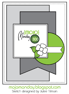
I have been wanting to make another quilt card ever since I made one for the  Heart 2 Heart Nip and Tuck Challenge, so I was pretty excited to see that the challenge this week is to combine either three different stamp sets or three different paper packs.  Isn't combining fabric (or papers) the whole idea behind a quilt?  Then I told myself that a quilt would be too easy and that since this is supposed to be a challenge, I opted to combine stamp sets using the Mojo Monday sketch below, and promising myself that I would make a paper quilt if I had time.
 
I started by stamping Love Doily on Colonial White paper with Versamark and embossing it with pearl embossing powder.  I then sponged over it with Champagne in the middle, blending into Cashmere towards the edges.  After I cut it out I sponged the edges with more Cashmere to give it an aged look which camouflaged any paper not cut away around the edges.  I then went to work on the roses from Floral Happiness, the March Stamp of the Month.  Helen Onulak has a great tutorial on her blog, Hooked on Stamping that shows how to get dimension with these stamps.  I just wish I had gone back and reviewed it instead of relying on memory.  I forgot about stamping off before rock and rolling the foundation stamp.  What I did was ink the foundation with Blush and sponge on some Smoothie (I am not that good at rock and rolling) before stamping it.  I then stamped the detail stamp in Hollyhock.  Not having the dimension I remembered, I went back, checked her blog and ended up using a q-tip to rub on some Colonial White.  After more fussy cutting (I am a glutton for punishment sometimes), I sponged some Champagne on the edges to "age" them.  The leaves were done in Sweet Leaf and Olive.  Except for the Cashmere ink, all the inks used on the roses were pigment inks which have a nice, velvety finish.  Next I made a panel using with a stamp from Universal Backgrounds with Slate ink and then sponged the edges with Champagne followed by Colonial White to tone it down a bit while still giving that aged look.  Can you see a theme here?  This is another one of those romantic, I love you and appreciate you cards for my husband which calls for some subtle distressing, but not torn edges.  I still like my edges clean!  I sponged the background layer with Champagne for a tone on tone look and aged the Blush border with more Champagne.  After stamping the sentiment in Slate, I sponged the edge with Blush, chased by Champagne and toned down with Colonial White.  Whew!  That was a lot of distressing!  Here is a close up of the focal point:


I did the same kind of distressing inside, but for some reason the distressing looks darker in the photograph.


After I finished Tim's card I had time to make a paper quilt card using Clementine, Buzz and Bumble and Roxie for my daughter's Godmother who just passed a big certification exam.  It just so happens that she is a quilter.  I do have a few tips:  Use a punch or Cricut to cut your squares to make sure they are exactly the same size.  I tried saving paper on my last quilt card by cutting my own squares and, trust me, a punch works better when you are piecing. They have to line up exactly.  It also helps to glue your design onto graph paper.  I marked out the over all square and made hash marks on the edges to show where the columns and rows would be.  Lastly, if your are going to dry emboss your finished quilt like I did, make sure it is no more than the width of your embossing folder.  I discovered this the hard way.  The brown border was supposed to be embossed as well but that made the width five and a half inches and my largest embossing folder is five inches, so I had to settle for embossing just the pieced part.  I got the pattern by casing this card at Jennabee Crafts.


So ends week two as guest designer for Heart 2 Heart Challenges.  Thank you for stopping by!  Now head on over and see what the others have done to Mix and Mingle paper and/or stamps.    Until next time, Hansi
 
Materials used, all from Close to My Heart unless otherwise noted:
 
Romantic card:
Paper:  For Always, Cashmere, Blush, and Colonial White cardstock
Ink:  Champagne, Cashmere, Blush and Slate dye inks, Blush, Smoothie, Hollyhock, Sweet Leaf, Olive, and Colonial White pigment inks
Stamps:  Love Doily, Floral Happiness (retired), Universal Backgrounds, A Friend Like You (to be retired, get it while you can)
Embellishments:  Tan Opaque Adhesive Gems, Pewter Badge Buttons (to be retired), Pearl embossing powder by Recollections 
 
Quilt card:
Paper:  Roxie (retired), Clementine (sold out), Buzz and Bumble (sold out), Vanilla Cream cardstock (retired)
Ink:  Cocoa plus a Smoothie alcohol marker
Stamp:  Limited Edition (retired)
Embellishments:  Color Ready Garden Wooden Shapes (to be retired), Tan Opaque Adhesive Gems


Saturday, July 6, 2013

Freshly Made Kitty With Butterflies


I have used Close to My Heart's Pacifica in paper packs with dark colors, but this is the first time I have used it by itself with White Daisy.  Talk about crisp!  This card was supposed to be black and white with pops of blue, but I liked Pacifica with white so much that black became the pop color. 

I have gotten so used to custom coloring my embellishments and so comfortable with coloring Color Ready Seam Binding that I automatically reached for my ink pad and began to color the Waxy Flax.  What a mess!  Then it hit me:  It's WAXY Flax.  There is no way a water based ink is going to take.  On the other hand, an alcohol marker worked just fine. The butterflies are popped up with the tiniest pieces of foam tape that I have ever cut. The embossing folder is a new one for me and I found I preferred the flipside for this card.  Here is the inside of the card:


This card was based on this week's Freshly Made Sketch by the talented Allisa Chilton which was designed to be clean and simple or dressed up.  My card ended up being somewhere in between.


Thank you for stopping by!  Until next time, Hansi

Materials used, all Close to My Heart unless otherwise noted:
Paper:  Pacifica, White Daisy and Black cardstock
Ink:  Black and Pacifica plus a Pacifica alcohol marker
Stamps:  Delight (retired), Eclectic Edges (retired), Card Chatter - Birthday, Pretty Kitty by Paper Inspirations
Embellishments:  Black Sparkles, Black Button (to be retired), Colonial White Waxy Flax (sold out)
Other:  Moroccan Screen embossing folder by Cuddlebug


Monday, July 1, 2013

Freshly Made in Pink, Black and White


Don't let this just before deadline posting mislead you, I found this layout from Freshly Made Sketches intriguing from the get go:


I love the curved line and the fact that the border does not go all the way around.  Of course that break in the border required me to think more carefully about my layers.  The first thing I did was measure, draw and cut a curved template.  In addition to needing one for the pink strip and embossed panel, I found the left panel was bulky enough that I need to trim it down so the embossed panel would lay smoothly (I know, it's kind of an oxymoron when the panel is embossed).  I knew that I wanted to use For Always paper  and planned on using Cotton Candy cardstock for the curve, but once I stamped the butterfly, I decided to use a subtly patterned paper from Lucy to complement the butterfly's texture. 

About that butterfly...  I inked my favorite stamp (from the retired Find Your Style set) with Cotton Candy and then used a sponge dauber to ink the edges with black.  After cutting it out, I sponged on a little more black to intensify the tips.  Of course cutting out the butterfly required amputating it's antennae, so I masked off the body on the stamp, inked the antennae in black and stamped them on the background before I embossed it.  If you want to see some more examples of masking, head on over to Heart 2 Heart Challenges which features masking techniques this week.  As y'all know, I cut sparkle flourishes to fit my needs, which leaves me with all sorts of pits and pieces, so I fit them together along the pink curve to give it some more pop and to compliment the butterfly's sparkle body.

Here is the inside of my card:


This is the time of year when my garden's needs conflict with my card making, so I was happy to finally be able to play with this sketch last night.  Thank you for stopping by!  Until next time, Hansi
 
Materials used, all from Close to My Heart unless otherwise noted:
Paper:  For Always, Lucy (retired), Black and White Daisy cardstock
Ink: Black, Cotton Candy
Stamps:  Find Your Style (retired)


Embellishments:  Black Sparkles, Black Sparkles Flourishes (trimmings)
Other:  Leafy Branch embossing folder from Cuddlebug

Exciting News!


I have learned so much and become a better card maker by playing challenges.  My favorite one is  Heart 2 Heart Challenges.  Not only do they provide a variety of challenges from theme to technique to sketches to product, they feature my favorite product line which, if you haven't figured out by now, is Close to My Heart.  At the end of each month, the design team selects the top ten entries spread among the month's challenges and a Top Chic of the Month.  I do not usually brag, but most months one of my cards makes the top ten.  As I scrolled down the winners list for May, I was a little disappointed to see that my "May Flowers" card was not selected for that challenge.  I think it is the best of all the cards I made last month.  As I continued to scroll down I saw why:  My card won the Top Chic of the Month award!  AND as Top Chic I get to play with the "Big Girls" as guest designer!  Yes, I am feeling a little nervous...
 
The first challenge in July a technique challenge.  This is my favorite kind because I get to try something new or get to revisit something I haven't done in a while, which is the case this month with masking.  This card uses two masking techniques.  The first one, which I used with the sentiment, is a pretty common one.  Have you ever wanted to use a particular stamp but did not want to use the whole image?  Simply put a sticky note over the part you don't want before you ink the stamp, remove the sticky after inking (critical step, lol), and stamp away.  Only the inked part shows.  Here is what the stamp looks like unmasked:
  
 
The second masking technique I used involves cutting out a shape, placing it on your paper and sponging around it.  When you lift up the shape you can see it in the un-inked part.  Think of it as reverse stamping.  My preferred sponge for this is the round yellow one which you cut into quarters because of the nice texture that allows other colors to show through.  I used CTMH's Art Philosophy Cricut cartridge to cut a solid butterfly (page 55) to use as a mask and a lacey one to use as a focal point.  A funny thing happened as I random stamped and my mask got covered with more and more layers of ink.  I liked the way it looked and used it as my focal point instead.  Here is a close up of it all dressed up with the new for summer glitter gems:


Did you notice that the butterfly's antennae come from the Find Your Style butterfly?  It does not show well, but I used a Sky alcohol marker to tint the bitty sparkles embellishing the embossed sentiment.  I was not really into markers until CTMH came out with alcohol markers.  Now I am working on my collection! Because one of the things I have learned from playing challenges is to decorate the inside, here it is:


Thank you, Allisa Childers, for inspiring me to pay more attention to the inside of my cards! 
 
So there is my first card as guest designer at Heart 2 Heart Challenges.  Whew!  Thank you for stopping by!  Now head on over and see what the others have done with masking.  Until next time, Hansi
 
Materials used, all from Close to my Heart:
Paper:  White Daisy and Smokey Plum cardstock
Ink:  Sky, Crystal Blue and Cotton Candy dye ink, Smokey Plum pigment ink, Sky alcohol marker
Stamps:  Live out Loud (retired), Find Your Style (retired)
Embellishments:  Pink Glitter Gems, Bitty Sparkles, Clear Detail powder
Other:  Cricut Art Philosophy cartridge
 
The example of the full stamp image:  White Daisy paper, Hollyhock, Smoothie, Sorbet, and Honey dye inks, Clear Detail embossing powder


Star for the Rose Garden


The second June challenge in the Rose Garden is to use the "Birthday Boy" key on the Cricut Artiste cartridge from Close to My Heart.  Great!  I have exactly zero young boys in my life to make a card for.  I was at a loss until this idea finally came to me at close to the eleventh hour.  This card is a 6.5 x 5 inch card to accommodate the large sparkle flourish.  I cut stars at 2.5 and 2 inches in the new glitter paper and 2.25 and 1.5 in black cardstock and layered them with liquid glass which seems to be the only adhesive that will hold on the glitter side of glitter paper.  The center is a retired designer brad.  The star and sentiment are popped up with foam tape.  Trust me, this card sparkles!  I will most likely use it as a birthday card as I have several friends with "milestone" birthdays coming up.

Thank you for stopping by!  Until next time, Hansi

Materials used, all from Close to My Heart:
Paper:  Black and White Daisy cardstock, Silver Flourish
Ink:  black
Stamp:  Fabulous You
Embellishments:  Sparkles Flourish, Rhinestone Designer Brad (retired)