A crop party is a modern quilting bee. A group of friends gather to have girl friend time, sharing joys and sorrows while preserving memories and creating a special keepsake.
Showing posts with label masculine. Show all posts

Sunday, January 28, 2024

Happy Birthday in Rainbow Colors


Happy Birthday to my not so little brother!  I started with the AAA Birthday prompt to use rainbow colors.   I smooshed Broken China, Wild Honey, and Worn Lipstick Distress Inks on different sized acrylic blocks, spritzed them with water, and one by one smooshed them onto watercolor paper.  I let each one sit for a bit to allow the color to seep into the paper.  Now what?  A few years ago I saw this card on Darlene Pavlick's blog and was inspired to buy the Oriental Screen die from Tutti and to fill in some of the openings with the negative pieces to create interest.  It has become my favorite background die.  I cut one from black and one from copper paper saving the leftovers for another card.  I used a CZ Design die to cut the sentiment once from copper paper and twice from black to stack.  I then cut the shadow from black.  I have to warn you that the shadow die cuts the openings in the b, d, and p's which on a busy background is distracting.  Because I used Hero Arts Color Hues Premium Pitch Black cardstock which is thick, completely matte, and has a black core, I could pop those cut out pieces back in without it being obvious.  You have to know what you are looking for to see the edges.  There was also, despite careful placement, an issue with black lines from the background cutting through the spaces between r and the t, and h and the b which looked klutzy and, again, distracting.  A pair manicuring scissors took care of that.  All that was left to do was attach the finished panel to a card base and stamp a sentiment inside.

In addition to the AAA Birthday Rainbow or Rainbow Colors, I am entering this card in the Seize the Birthday Anything Goes, and Creative Crafty Uncles Happy Birthday challenges.  You can visit these blogs to see more birthday cards to inspire you and maybe enter.  All three will be active for a few or more days.

Thank you for stopping by!  Until next time, Hansi


Sunday, January 21, 2024

Trying a New Technique With a Never Used Embossing Folder


For this card I used a new to me technique featured in this Jennifer McGuire video.  You emboss a piece of watercolor paper, spray it with your favorite ink spray and water, let it dry, and repeat until you like how it looks.  Then, because all that water will somewhat flatten out the paper, you emboss it again.  Embossing before spraying encourages the ink to pool in ways that enhance the design.  I needed a birthday card for my husband, so I flipped through my embossing folders for something a little masculine and found a Tim Holtz 3D Texture Fades folder that I have had for something like five years and had never used!  How did that happen?!  I am sure y'all never lose track of what you have...  The folder is called Foundry and I used Tree Lot, Frosted Juniper, and Antiqued Bronze Distress Mica sprays.  I used A Paper Rose die to cut the sentiment twice in thick black cardstock and once in Copper Foil paper and stacked them.  The cats were cut from some brown metallic paper from Michael's using a set from Impression Obsession and stacked on more black cardstock.  I found they faded into the background, so I used some Pebo Copper Guilding Wax which is a new addition to my craft collection, I mean stash, to give them more dimension and make them pop out.  Our pointy ear darlings would tell you that is how it should be because the cats are the most important element.

Here is the inside of the card.


I stamped a sentiment from Close to My Heart twice using Rustic Wilderness Distress Oxide ink and then dabbed a Copper Color Box pigment pad on some of the edges of the stamp and stamped a few times.  I love my MISTI!  It doesn't show well in the photo but shines in real life.  The strip at the bottom was leftover after trimming down the front panel.  My water color paper is 9x12 so I start with 4.5x6 paper.  Tim Holtz embossing folders are 6 inches inches long to accommodate standard the card size in the U.K.  I like having trimmings to play with.

I plan to enter this card in the Cut It Up challenge to use a new product, tool, technique, etc., the Die Cut Divas challenge to use a never been used item, Seize the Birthday challenge to use embossing, Color Hues Challenge to use copper and green, and the Mix It Up challenge to make anything with the option of mixed media.

Thank you for stopping by!  Until next time, Hansi



Monday, January 9, 2023

Birthday Card For a Cat Dad


I need a birthday card for my husband, a devoted cat dad known as Soft Touch by our furry, pointy eared darlings.  Once again Freshly Made Sketches has provided the purrfect sketch to use my favorite cat die from Obsession Impression.


I have always cut the cats from black cardstock and placed them against bright colors or on a black and white card.  This time I cut them from white cardstock for a white CAS (ish) card with a pop of color provided by a background I made using watercolor paper and Lindy's Magicals which are like Brusho powders with mica in them.  I used the Victorian Bouquet set which has green mica in some of the colors.  For each block I used Hero Arts square Infinity dies to cut two squares to stack and then taped two dies together to cut a frame for the third layer.  I then used the smaller, "inside" die to cut a square of the background to inlay.  I cut two of each cat and stacked them to give them some dimension.   For the panel I used a die from Altenew's Mix and Match Frames set and trimmed off one end for a 4x3 panel and backed it with more of the background.  I heat embossed a sentiment from an old Close to My Heart set, Holiday Tags, in silver.

Inside I heat embossed a sentiment from Gina K Designs' So Many Sentiments set and used some of the extra cats and scraps to pretty it up.


I also plan to enter this into the AAA Birthday Anything Birthday and Show Us Your Pussycats Anything Goes challenges.  Thank you for stopping by!  Until next time, Hansi


Monday, February 14, 2022

For an Artist Turning 80


Although I shouldn't after all these years, I still get a little nervous making cards for my brother-in-law, an artist who taught printmaking at the local university for 51 years.  I brayered Medium Magenta and Bright Aqua Green Liquitex acrylic paints onto my gel press and pulled a print for the background.  The interesting thing is when you mix red and green you get mud, but for some reason when you mix a turquoise green and pink you get mauve and violet.  I cut out a piece to use on an A2 sized card, and then used Birch Press Design's String Frame die to cut a cover plate from silver foil.  I cut the numbers three times from white cardstock and once from the darkest sheet in Stampin' Up's silver specialty paper pack.  I love the purple cast and lined texture of it.

Here is the inside.


The sentiments was cut from the same paper and print using a Simon Says Stamp die by CZ Design.  My brother-in-law and sister have a spoiled rotten ginger cat, so I used a die from Spellbinders to cut a cat from a scrap from another gel press print.

I plan to enter this in the Mix It Up Anything Goes Plus Optional Foiling, Seize the Birthday Sparkle and Shine, and Happy Little Stampers Anything Goes With Dies challenges.  Thank you for stopping by!  Until next time, Hansi


Sunday, January 9, 2022

New Year, New Toys, New Techniques


I bought a gel press last fall and never had time to play with it, so you could say it is new to me and using it with acrylic paint is a whole new experience.  Acrylics don't behave like ink and have a bit of a learning curve, but you can get effects you can't get with ink.  It is definitely a lesson in letting go because despite your planning, you can never be sure exactly what you are going to end up with.  That's part of what makes it so fun!  Right now I am practicing putting down a layer using different colors of paint and picking it back up on paper, otherwise known as pulling the print.  

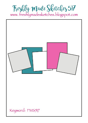
I needed a birthday card for my husband, had a bunch of prints, and saw this Freshly Made Sketch:


I could see little cats sitting/standing in squares cut from my prints just like they were in windows.  Did I mention he is the world's best catdad?  I cut pieces out of several prints, sponged Archival ink along the edges and set about to arranging them, deciding on the more muted colors for the front and using the leftover bolder pieces for the inside below:


I used a die from Obsession Impression that doesn't seem to have a name other than Cat Set (DIE083-K) to cut the cats on the front from glossy black cardstock  and the ones on the inside from regular black cardstock.  I used a Simon Says Stamp die to cut the Happy Birthday from glossy black cardstock, the Kat Scrappiness die set, Pet Sentiments Brush Script Word and Sentiments, to cut the word love, and an old Stampin' Up die to cut the word you.  The card base was cut from Hero Arts Hero Hues Premium Pitch Black 111 lb. cardstock. 

I am also entering this card in the Cut It Up Birthday Card and Time Out New challenges.  Thank you for stopping by!  Until next time, Hansi


Friday, October 29, 2021

A Cool "Burnt Wood" Technique


I had been pondering all week how I would use the Paper Players sketch below when I saw this video by Gina K Design. 


Essentially you score a piece of cardstock, lightly swipe ink over it, set up the sandwich for embossing a die on your die cut machine, place the panel face down on the rubber mat and the stencil on top, emboss the stencil (which actually debosses it), and then swipe more ink over it.  Being in full Christmas card mode, I used a snowflake stencil from Stampin' Up.  Rather than use the colored pencil and Gamsol technique Gina used, I lightly colored the snowflake impressions with a colored pencil.  I cut 1.5 x 3.75 inch panels, swiped more ink round the edges, and stacked each on two layers of heavy Very Vanilla cardstock for dimension.  I attached the outer two panels first and then lined up the middle panel evenly between them.  HINT:  Pay attention to how the design lines up.  I had to perform a card-ectomy because I attached the middle panel upside down.

I had sort of an antiqued brass embellishment I wanted to use to anchor the sentiment, but it did not show well.  I tried coating it in gold embossing powder, but it still didn't show, so I tried platinum powder from Ranger which worked, but I did have to sacrifice some of the detail.  I like to think it evokes the look of old worn hardware on a wooden cupboard.  I used the same powder to emboss the sentiment and gild the edges.

This technique would work well for any masculine card.  Thank you for stopping by!  Until nexy time, Hansi

Monday, June 21, 2021

Father's Day 2021


Father's Day is bittersweet for me as Daddy passed in 2013, but there is another Daddy in my life, my husband, who is a devoted father to our grown daughter with special needs and gets card from me every year to show my appreciation for all he does.  This year's is based on this Freshly Made Sketch:


I started by smooshing Cracked Pistachio, Salvaged Patina, Peacock Feathers and Walnut Stain Distress Oxide inks onto a piece of cardstock for the strip and blending the same colors minus the Walnut Stain on a small piece that I cut using a stitched oval die from Stampin' Up.  While I was at it I cut two more ovals to stack for dimension and sponged some Salty Ocean ink around the edge.  The dad cat was cut with a die by Spellbinders and the kitten with one by Obsession Impression from bronze metallic paper I bought in an assortment pack years ago at Michael's.  It doesn't show that the bronze paper and the pearl paper I used for the hearts has a nice shimmer.  I used a colored pencil to make a bit of a shadow below the kitties to ground them.  Did I mention that my husband is also daddy to two spoiled cats?  I stamped a sentiment from Close to My Heart's Say It in Style set in Peacock Feathers Distress Oxide ink and heat embossed it with Clear Detail powder from Ranger.

I also plan to enter this card in the Male Room Dads and Grandads, Crafty Gals Corner One for the Boys, and Stinkin Inkers You're the Man challenges.

Thank you for stopping by!  Until next time, Hansi


Monday, May 31, 2021

A Fishy Birthday


I struggle with masculine cards, so I usually fall back on graphic or geometric designs.  This time I needed a card for a friend who does semi abstract metal sculptures mostly of sea creatures and thought the Tim Holtz Stampers Anonymous  Sealife stamp set might be appropriate.  I started with a sheet of Tim Holtz water color paper, blended some Distress inks on the rough side, and spritzed it with lots of water to make the colors run together like water colors.  I then lightly rubbed ink minis over the surface to add texture and depth.  I stamped the kelp in black along the bottom and then heat embossed the two fish in white.  I used a Simon Says Stamp die to cut the sentiment, coated it with Versamark ink and white embossing powder and then heated it to make it shine and give it the appearance of a puffy sticker.  Lastly I attached some Studio Katia clear drops for air bubbles.  After sponging some more ink around the edges to define them, I attached the panel to a white card base.

I plan to enter this in the Male Room Water/Beach, Modsquad Under the Sea, Sweet Stampers Animals or Critters or Birds, Bastel-Traum Water (#btchallenge101) , and bizarrely, Happy Little Stampers June Watercolor challenges.  To show how international the challenge blogs are, as I write this May 31 at 10:30 p.m. Eastern Daylight Time it is 12:30 p.m. on June 1 Australian Eastern Standard Time where the Happy Little Stampers challenges originate.

Thank you for stopping by!  Until next time, Hansi


#btchallenge101


Sunday, August 30, 2020

The Star of My Life


Most of the cards I make for my husband are of the more romantic variety, so I don't have to worry about designing a masculine card, but to me, his birthday calls for one.  I don't know about y'all, but I struggle with masculine cards.  Fortunately he has two hobbies, astronomy and cooking, which gives me some direction.  For this year's card I went with a star for astronomy.

I started by blending Tranquil Tide, Night of Navy, and Blackberry Bliss inks from Stampin' Up on white cardstock.  Then I sponged on Champagne Mist shimmer ink by Tsukineko over it to give it a gold shimmer that is not that visible in the photo, and set it aside to dry.

Next I cut a 5.5 X 4.25 piece of copper foil paper to use as a mat. To conserve specialty (in other words, expensive) paper, I used the So Many Stars dies from Stampin' Up and a die by Simon Says Stamp to cut the stars and sentiment. Once the inked panel was dry I positioned the die cuts to fine tune the composition, moved the copper star, and cut a medium sized star out of the inked paper under it. I cut a second mediumd star from scrap paper and popped it in the negative space, so the surface would be smooth. I used a stamp from the So Many Stars set to emboss the filigree pattern in copper on that medium star.  After stacking the stars I attached them to the background, rotating the star so that the Night of Navy and Blackberry Bliss points were backed by the opposing colors.  This helped the inked star stand out.  Of course, I had to finish the card off with a sparkle in the center of the star.

I am entering this card in the Watercooler Wednesday Occasions Challenge, the Just Add Ink Challenge to make a card for a guy, and the Seize the Birthday Challenge with an optional topping of adding gold.  So why did I use copper foil paper instead of gold?  After applying a gold shimmer to the background, I found that the copper stood out better and had more of a nighttime feel to me.

Thank you for stopping by!  Until next time, Hansi


Monday, August 24, 2020

Freshly Made Triangles


Long time no post!  It isn't that I haven't been making cards; I just haven't had time to photograph them before sending them or haven't gotten them finished in time to meet a challenge deadline.  As it is, this one is getting in just under the wire.  When I saw this Freshly Made Sketch I was so excited because I had just gotten the Prismatic Triangle layering dies by Birch Press Design and wanted to play with them.  


At first I thought I would cut off the extraneous triangles, but then it seemed like the composition would be out of balance, so I thought I would just not color them in which was also unbalanced until I pulled the color through by putting the sentiment on a background using same colors as the triangles that are part of the sketch.  Leaving the edges of the extra triangles ties the sentiment piece to rest of the design.

I started by using blending brushes to blend Peacock by Close to My Heart with Night of Navy and Rich Razzleberry from Stampin' Up on white card stock and cutting it with Layer C (bottom layer) to get the filler pieces to color the triangles.  If you have not tried blending brushes I highly recommend them.  They make it so easy to create smooth blends!  I layered two layer C's and a layer B cut from white cardstock and one layer A cut from Champagne foil cardstock from Stampin' Up.  Champagne is like a warm silver.  I also used it for the sentiment cut with a Simon Says Stamp die. The sentiment piece is popped up with thin foam tape.  Although I usually cannot resist adding some sparkles, this time I felt they would detract from the clean geometry of the design.


Thank you for stopping by!  Until next time, Hansi

Monday, June 24, 2019

The Best Laid Plans...


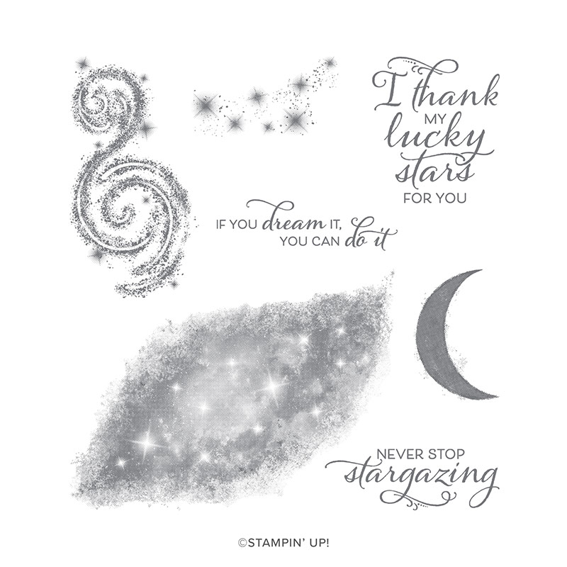
My husband is into astronomy, so when I saw the Stargazing stamp set in Stampin' Up's new catalog I knew it was the perfect set for a Father's Day card for him from me.  To paraphrase Robert Burns, the best laid plans of mice and men...


I ordered the set the morning of June 4th as soon as the catalog went live.  It shipped on June 6th.  On June 8th UPS turned it over to the Postal Service in Sandston, Virginia, the hub for Central Virginia, for an estimated delivery date of June 11th.  Plenty of time to make a card, right?  It was not delivered on the 11th, or the 12th, or the 13th.  That evening the UPS tracker revealed it to be in Myrtle Beach which, if you are not familiar with beaches on the east coast, is two states away in South Carolina!  Maybe it wanted a vacation after the long trip from Utah.  My order finally arrived the day after Father's Day and this weekend I had a chance to play with it.

The original plan was to stamp the nebula/galaxy in dark ink over a watercolored base to let stars show through in pastel colors, use the star cluster stamp to emboss a few stars in white over top, and finish it with that perfect sentiment.  I began by watercoloring on the smooth side of Ranger watercolor paper.  Now watercolor is an exercise of letting go as the water will move color where it wants to and changes it as it dries.  This is what I ended up with.  I apologize that I did not think to photograph it before I started trimming cutting it up.


I was working with this Freshly Made Sketch and thought the darker bleeding purple parts would make a good stripe.


I wanted to cover the whole center panel with the galaxy stamp which meant I would have to make multiple images and blend them.  Plus, I did not really want to have that center section of the stamp be so light.  After practicing on cardstock I decided the best bet would be to pounce ink on using a small thin Life Changing brush.  I used the same technique to color narrow strips of the watercolored paper.  Next I tested the star cluster stamp with Gina K fine detail white embossing powder on my galaxy test piece.  I am glad I did because no matter how fine a powder you use, Stampin' Up's DistINKtive stamps do not translate well with embossing.  Next I sprayed on some Perfect Pearls mixed with water to make the galaxy shimmer.  Note to self:  watercolor paper is not cardstock!  Although the spray worked well on my test piece, it did cause some running of the Night of Navy ink on the watercolor paper, softening the stars.  Then again, if you have ever looked though a high powered telescope on a hot, humid night there is some softening of the image, even when there is no condensation on the lens.

I heat embossed the sentiment on paper from DCWV's Weathered paper stack, cut it out with a thin die, pressed the edges into the Night of Navy ink pad, and attached it with foam tape.  A few sparkles finished the card off.  Whew!  I am also entering this card in the Watercooler Wednesday Challenge to make a masculine card and the Happy Little Stampers watercolor challenge.

Thank you for stopping by!  Until next time, Hansi


Monday, June 17, 2019

Father's Day Cats 2019


This Father's Day card from our two and four legged daughters is based on this Freshly Made Sketch:


I started with a 4.25 x 5.5 inch piece of white cardstock and applied Candied Apple, Ripe Crimson, and Dried Marigold Distress Oxide inks, blending until I was happy with the result.  While I had the ink out I covered a small piece with Candied Apple, so I could have matching sentiment strips.  I cut the large cat using Close to My Heart's Artistry Cricut cartridge, the medium cat using a die from Spellbinder's Kitty Cats die set, and the little cats using Impression Obsession's Cat Set.  Then I heat embossed them with three coats of clear detail powder.  The sentiment was stamped with an old Close to My Heart set, Say It in Style using Black Versafine ink, heat embossed with clear detail powder and attached with foam tape.  The finishing touches were cut from Stampin' Up's Grapefruit Grove foil paper which has a hologram effect to it.

Thank you for stopping by!  Until next time, Hansi
Monday, June 3, 2019

Peek-a-boo Gull


If CAS means lots of white space and minimal embellishments, this card would qualify, but I am not sure I can say simple because lining up the die to cut the window in the right place was fun and games.  I started with this Freshly Made Sketch:


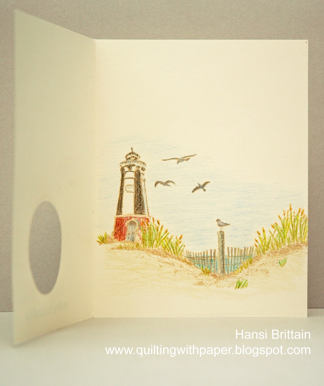
I knew I wanted to make a summer themed card for the Paper Players Challenge, and I had just discovered the Daring Cardmakers intriguing challenge to create a secret hideaway for an element of your card.  I found myself thinking what if I made the circle on the sketch a window which only showed a hint of what was inside.  Some of y'all may know that I grew up where the Chesapeake Bay meets the Atlantic Ocean and have a thing for lighthouses, so this is what you see when you open the card.  


First I stamped the inside using Antique Linen Distress Oxide ink and Close to My Heart's Perfect Day and Seaside Greetings stamp sets.  Then I cut a window and stamped the front.  After coloring with Prismacolor pencils, I stamped the sentiment from Altenew's Quilted Elegance in Black Soot Distress Oxide Ink.  Then as I wrote the above sentence and looked at the sketch again I realized I had not noticed that it includes an element along the left edge, so I stamped the edge with Stampin' Up's Wood Background stamp and re-shot the photo.  Can I get this posted and linked in time?

Thank you for stopping by!  Until next time, Hansi