A crop party is a modern quilting bee. A group of friends gather to have girl friend time, sharing joys and sorrows while preserving memories and creating a special keepsake.
Showing posts with label Love. Show all posts

Monday, February 27, 2023

Love Always


I made this card for the Die Cut Divas "Show Us Some Gold" and Show Us Your Pussy Cats "Love" challenges and waited to post it until after I gave it to my husband who sometimes reads my blog.  Then I forgot, so here it is just under the wire. 

I started by spraying a 9x12 sheet of bristol paper with Dina Wakely Turquoise and Ocean gloss sprays and Tim Holtz Tarnished Brass Distress spray stain and cutting out a square of it, saving rest to be used on other cards.  Eventually...  To add interest I inked the Sacred Spells stamp from Lavinia with Stampin' Up's Tranquil Tide ink and used second generation stamping on the right side and dabbed some of it along the bottom.  To gild the edges I held the panel upright and pushed each edge into Versamart ink and Ranger Princess Gold embossing powder and heated it.  I also heat embossed the sentiment using a stamp from Hero Arts' Smile stamp and cut set.

I stacked 3 die cuts made using Penny Black's Kitty Love die and colored the heart.  When I didn't like the colors I used I added a fourth layer with the heart colored using Spun Sugar, Abandoned Coral, and Festive Berries Distress inks topped with Wink of Stella and liked it much better.  I popped up the square with two more slightly smaller squares of cardstock and finished it off with an acrylic star.

My husband, known as Soft Touch to our cats, loved the card.  Thank you for stopping by!  Until next time, Hansi 


Tuesday, February 22, 2022

Moongazing Love Cats


This card was inspired the photo prompt below for the Through the Purple Haze "Anything Goes With Optional Color Palette" challenge using a love theme for the My Time to Craft "All You Need is Love" and Cut It Up "Love or Valentine's Day" challenges.

 I started by blending Ripe Persimmon, Peacock Feathers, Broken China and Chipped Sapphire Distress inks onto white cardstock.  I cut the cats using a punch from Stampin' Up, flipped one and intertwined their tails.  After making note of where they would be on the card I carefully masked off parts of the Wildflowers stamp by Simon Says Stamp so the flowers would frame the cats without creating busyness behind them.  I cut the heart out of Grapefruit Grove holographic paper from Stampin' Up using one of their dies and used another Stampin' Up die to cut the word love three times and stacked them.  Once assembled, I matted the panel with more of the Grapefruit Grove holographic paper and black cardstock.  Lastly I embellished the card with Iridescent Crystals from Studio Katia.

Thank you for stopping by!  Until next time, Hansi


Monday, October 18, 2021

A Cat Themed Anniversary Card


The festivity being celebrated at Festive Friday is National Cat Day which is confusing to Luna and Calli because, as any cat will tell you, EVERY day is National Cat Day, International Cat Day, AND World Cat Day.


To enter the challenge you do not have to make a card featuring a cat.  You just have to select three items from the inspiration list below:


I used a cat (two actually), heart, and love sentiment to make an anniversary card for my husband or, as Luna and Calli like to call him, Soft Touch.

I started by taping a piece of 4.25 x 5.50 inch watercolor paper to my glass mat to keep it from curling, taped a deckled edge rectangle stencil from A Colorful Life Designs over it, and placed a circle mask cut from Gina K Design Masking Magic where I wanted the moon to be.  I used blending brushes to apply various shades of pink, blue, and violet Distress inks, spattered it with water using a fan brush, and once dry, re-applied the inks lightly and not necessarily in the same places to tone down the splatters and allow layers of colors to show through.  Without using a block, I inked a small acrylic text stamp with Basic Gray ink from Stampin' Up, stamped some of the ink off onto scratch paper, and stamped different parts of it along the left side and in the lower right corner.  I used the flower bouquet stamp from Stampin' Up's Very Vintage set to stamp the flowers around the cats and the Grass and Borders stamp from Nellie's Choice to stamp along the bottom.  The thickness of the stencil kept the "meadow" from reaching the edges, so I used a small brush to apply some ink along those edges.  I also brushed a bit of Hero Arts' Unicorn pigment ink outward around the moon.  Now it was finally time to remove the stencil and mask.  I used a small brush to apply Colonial White pigment ink from Close to My Heart and Silver pigment ink from ColorBox to the moon to give it some texture and dimension.  I also outlined the moon with a Gelly Roll Stardust pen.  

With inking done it was time for die cutting.  I used Penny Black's Kitty Love die to cut the cats from black and silver foil cardstock.  This gave me a silver heart to use where the cats' tails meet and silver cats for my stash to use on another project.  The sentiment was cut from silver foil using a die from Gina K Design and embellished with clear bitty sparkles.  I attached the panel to a card base made from Stampin' Up Purple Posy cardstock.  Here is the inside:


The sentiment from Close to My Heart's The Happy Couple set is embossed in silver.  The cats were cut using a die from Impression Obsession.  

I am also entering this card in the Happy Little Stampers' October Anything Goes With Dies challenge and the Critter Crazies' Anything Goes With a Critter challenge.  Luna and Calli are not sure how they feel about being referred to as "critters" but, as well brought up Southern Ladycats, are too polite to say anything.  Thank you for stopping by!  Until next time, Hansi 


Tuesday, April 20, 2021

Unconventional Wedding Card


My cousin's daughter was recently married in his backyard with only her immediate family in attendance, blowout party to celebrate with extended family and friends to follow at a later, safer date.  This may seem like an unconventional card for a newlywed couple, but you have to know the couple.  The bride wore a black modern take on a 1950's prom dress with black, clunky heeled, ankle booties and a wreath of roses in her hair.  The groom wore black pants and a black shirt with a grey blazer and a rose  boutonniere to match the bride's headpiece.  Somehow an ivory and gold card does not seem appropriate for them.

I used the Mid-Century Frame die by Altenew to cut the frame in black cardstock and realized afterward that I should have backed it with adhesive paper before cutting.  Oops!  I then cut another frame from white cardstock, placed some adhesive paper behind the opening and inlayed the black frame filling it in with the negative space white pieces.  I then used the Kitty Love die by Penny Black to cut the cats in black and from the center of the Majestic holographic paper from Close to My Heart that I planned to use as a mat so I would have a heart to inlay.  I put it all together hoping for a modern Art Deco vibe.  I matted the panel on the Majestic paper and Black card stock before putting everything on a white card base.   Originally I did not fill in the tiny white pieces in the frame because it would be hard to fit them in, and I figured no one would notice since it was backed with white paper. I decided the frame needed something more, so I cut another frame from Majestic paper just so I would have the six tiny dots to fit in the black frame.  I already know what I will do with that extra frame.  The sentiment is from the Just to Say stamp set from Close to My Heart.

I plan to enter this card in the Daring Cardmakers'  challenge to use back and white plus one other color and the Happy Little Stampers April Die Cut Challenge.

Thank you for stopping by!  Until next time, Hansi


Tuesday, October 13, 2020

An Anniversary Card for the Color Hues Challenge


I am not usually a fan of color challenges.  They often ask you to combine three or four colors and specify the shade of the color which is just too confining for me.  The new Color Hues Challenge picks two colors, and you are free to use different shades of that color plus neutrals.  This week's challenge was to use Cream and Gold.  I can finally post my entry.  You see, this is an anniversary card for my husband, who sometimes looks at my blog, so I had to wait until I gave it to him to post.  Yes, we did get married on a Friday the thirteenth.  

I do not remember who made the heart with the leaves.  A few years ago a friend came over to do some crafting and bought the die with her.  I cut one to keep in my stash.  The second heart came with my Gemini Jounior and the love sentiment is an old Stampin' Up die.  I heat embossed each die cut with three layers Ranger Princess Gold and set them aside.  For the front panel I used Ranger Vintage Pearl to heat emboss the Rebecca Lace Background stamp from Simon Says Stamp on Colonial White cardstock from Close to My Heart.  To get the gilded edge, I held the paper perpendicular to a Versamark stamp pad and pressed the edge into it and then heat embossed the edge with more Ranger Princess Gold embossing powder.  I wanted the plain heart to have some leaves to compliment the large heart, but of course, I didn't have the die, so I cut a few leaves from the Simon Says Stamp Circle of Leaves die and heat embossed them with three layers of the Vinatage Pearl powder.  I put everything together, popping uo the panel with craft foam.   I embellished the large heart with a few small pearls.  Here is the inside:


Thank you for stopping by!  Until next time, Hansi


Monday, June 24, 2019

The Best Laid Plans...


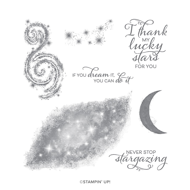
My husband is into astronomy, so when I saw the Stargazing stamp set in Stampin' Up's new catalog I knew it was the perfect set for a Father's Day card for him from me.  To paraphrase Robert Burns, the best laid plans of mice and men...


I ordered the set the morning of June 4th as soon as the catalog went live.  It shipped on June 6th.  On June 8th UPS turned it over to the Postal Service in Sandston, Virginia, the hub for Central Virginia, for an estimated delivery date of June 11th.  Plenty of time to make a card, right?  It was not delivered on the 11th, or the 12th, or the 13th.  That evening the UPS tracker revealed it to be in Myrtle Beach which, if you are not familiar with beaches on the east coast, is two states away in South Carolina!  Maybe it wanted a vacation after the long trip from Utah.  My order finally arrived the day after Father's Day and this weekend I had a chance to play with it.

The original plan was to stamp the nebula/galaxy in dark ink over a watercolored base to let stars show through in pastel colors, use the star cluster stamp to emboss a few stars in white over top, and finish it with that perfect sentiment.  I began by watercoloring on the smooth side of Ranger watercolor paper.  Now watercolor is an exercise of letting go as the water will move color where it wants to and changes it as it dries.  This is what I ended up with.  I apologize that I did not think to photograph it before I started trimming cutting it up.


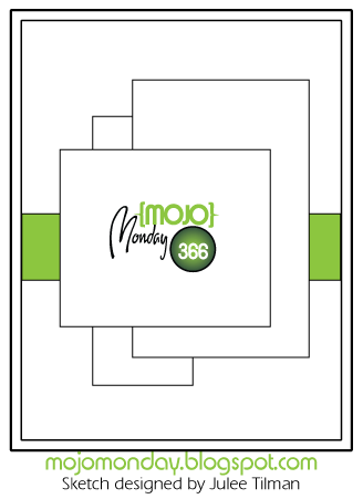
I was working with this Freshly Made Sketch and thought the darker bleeding purple parts would make a good stripe.


I wanted to cover the whole center panel with the galaxy stamp which meant I would have to make multiple images and blend them.  Plus, I did not really want to have that center section of the stamp be so light.  After practicing on cardstock I decided the best bet would be to pounce ink on using a small thin Life Changing brush.  I used the same technique to color narrow strips of the watercolored paper.  Next I tested the star cluster stamp with Gina K fine detail white embossing powder on my galaxy test piece.  I am glad I did because no matter how fine a powder you use, Stampin' Up's DistINKtive stamps do not translate well with embossing.  Next I sprayed on some Perfect Pearls mixed with water to make the galaxy shimmer.  Note to self:  watercolor paper is not cardstock!  Although the spray worked well on my test piece, it did cause some running of the Night of Navy ink on the watercolor paper, softening the stars.  Then again, if you have ever looked though a high powered telescope on a hot, humid night there is some softening of the image, even when there is no condensation on the lens.

I heat embossed the sentiment on paper from DCWV's Weathered paper stack, cut it out with a thin die, pressed the edges into the Night of Navy ink pad, and attached it with foam tape.  A few sparkles finished the card off.  Whew!  I am also entering this card in the Watercooler Wednesday Challenge to make a masculine card and the Happy Little Stampers watercolor challenge.

Thank you for stopping by!  Until next time, Hansi


Sunday, February 17, 2019

Freshly Made Sketches Meets Color Throwdown for Valentine's Day


After my last post about a valentine for a friend to give to her husband, please don't think I neglected my own husband.  Here is the one I made for him using this Freshly Made Sketch and this week's Color Throwdown colors, dark pink, black and gray:


I started by using the A Layer of Birch Press Design's Adora layering die set to emboss the background.  Do you think that can count as the leaf element?  The smaller heart is Melon Mambo layered over three black hearts, brushed with Wink of Stella and Glossy Accents for sparkle AND shine (although it does not show well in the photo).  The black layers subtly echo the word "love" which was cut from black glossy paper.   For the "gray" elements I used Champagne foil paper and gray sparkles.  The card front is popped up with a piece of craft foam for added dimension.


Here is the inside which I embellished with hearts leftover from the card in my last post.  The stamping is embossed with silver and Versamark ink and clear detail powder over black ink.


Yes, he liked it.  Thank you for stopping by!  Until next time, Hansi

Materials used:
Paper:  Neenah Classic Crest Solar White 110 cardstock, black and Melon Mambo cardstock, Champagne foil paper, and black glossy paper from Stampin' Up
Ink:  Raspberry Pigment ink from Close to My Heart, Onyx Black Versafine ink, Versamark ink
Stamps:  Thoughtful Messages by Simon Says Stamp, Mad About You by Close to My Heart
Embellishments:  Gray sparkles from Close to My Heart, Silver detail embossing powder by Ranger, Clear detail powder by Stampendous
Other:  Adora Layer A die by Birch Press Design, Sweet and Sassy framelits from Stampin' Up, Cupid Hearts Border die by Simon Says Stamp, Opulent Swirls die by Crafter's Companion for Gemini


Monday, February 11, 2019

Shiny Valentine


This is a Valentine for a friend's husband.  Before you get the wrong idea I have to tell you that she asked me to make it for HER to give him.  I made it following this Freshly Made Sketch and assorted foil papers from Stampin' Up.


I cut the hearts using the three smallest dies from the Stampin' Up Sweet and Sassy framelits set and Simon Says Stamp's Cupid's Heart Border die from four foil papers (Black, Champagne, Lovely Lipstick and Grapefruit Grove) and proceeded to play mix and match.  Yes, I have a lot of hearts for other projects...  The overlapping hearts are popped up with thin foam tape.  For the word "Love" I used the die from Hero Arts Love stamp and cut to cut two from black cardstock and one from black foil paper and stacked them.  The rest of the sentiment was embossed in copper using words from the Thoughtful Messages set from Simon Says Stamp.  This required cutting (gasp!) the word "you" from the sentiment strip "you more today than yesterday."

This picture does not accurately show how shiny the hearts and "Love" sentiment are.  The Grapefruit Grove is particularly beautiful because it has a holograph effect when you tilt it, appearing to be copper until the changing angle of the light lets you see waves of pink and a bit of green shimmer.

Thank you for stopping by!  Until next time, Hansi

Monday, October 29, 2018

Anniversary Card for the Card Concept


My husband and I celebrated our 40th anniversary last week.  (I was a child bride...)  Such an occasion calls for a romantic, non-masculine card which I made using this photo from The Card Concept as inspiration:


I am not sure how he would have felt about a pumpkin, so I went with the pink, ivory, and gold color scheme and flowers.  First I inked up the "valley" side of my new Tim Holtz Alterations Botanical 3D Texture Fades embossing folder with Aged Mahogany Distress Oxide ink, spritzed some Colonial White cardstock with water, and carefully placed it in the folder to run through my Big Shot.  Afterwards I spritzed it with a mixture of Perfect Pearls and water.  When it was dry I used a sponge dauber to dab on some gold pigment ink from ColorBox and added a little Princess Gold embossing powder by Ranger.  Lastly I diecut a heart and kept the rest for a future project. 

Next I used the Hero Arts Love stamp and die set to cut three "Love" sentiments and stacked them.  I smooshed it in Versamark and then embossed it with Vintage Pearl embossing powder by Ranger three times.  

For the background panel I cut a rectangle using a die set I got from a friend who was decluttering.  It looks like a Nestabilities set from Spellbinder's.   I cut the ends off, sponged the edges with Versamark, and embossed with more gold embossing powder.  While I was at it I gold embossed the word "always"  from the Simon Says stamp set Thoughtful Messages beside where I planned to place the heart. Finally I gave it a spritz with my homemade pearl spray.

Finally I put everything together and attached it with foam tape to a Colonial White card base.   I wish the photograph captured the pearly shine and gold sparkle of the card.  It is sort of clean and layered meets classy and elegant.  Thank you for stopping by!  Until next time, Hansi


Saturday, October 14, 2017

Eclipse of the Heart


Yesterday was my wedding anniversary, and yes, we got married on a Friday.  I have been wanting to try an Eclipse card.  If you are not familiar with the technique, the idea is you die cut letters, or in my case shapes, out of your image and then put them back in place popped up.  Right now I am seeing a lot of cards using letters, but I like to put hearts and flowers on my romantic cards for my husband, so I went with hearts instead spelling out the word love.  He knows I love him, right?

First I want to talk about challenges.  I started this blog five years ago this month, so I could participate in the Mojo Monday challenge because I wanted to give myself "homework assignments" and grow as a cardmarker.  My cards have definitely evolved as the number of challenges I follow has grown.  I have just started following two new for me ones:  The As You Like It Challenge asks you to make a choice between two items, themes, etc. or maybe pick a favorite something such as paper and then explain why you made that choice.  This week the challenge is ribbon or flowers.  For an anniversary card that is easy.  My husband has always given me roses for no reason except that they are pretty and he thinks I will enjoy them.  Even in our starving student days he would sometimes stop by a florist and buy a single rose.  It should come as no surprise that most of the anniversary and I love you cards I make for him include roses.

The second challenge I have begun following, Happy Little Stampers, has several challenges each month that run for the entire month so you have plenty of time to work on your entry(ies).  They are designed to "inspire you to create using techniques or products that may be new to you or just a refresher on using them."  Each month there is a Watercolor (or any medium using water), CAS, Christmas, Mixed Media, Anything Goes With a Die Cut, and ATC challenge.  This card is for the Die Cut challenge.

If you like pink, with October being Breast Cancer Awareness month, a number of challenges including The Sisterhood of Crafters, Craft Rocket Challenges, Fussy and Fancy Friday Challenge want to see projects featuring it.  I am also entering this in the Stamps & Fun = Creativity challenge to make something "non cute."

Now back to the card:

I started with a stamp from the Lady Rose set by Tom Holtz whose designs are often messy with a lot of texture and a vintage feel.  This is what it looks like stamped with black ink on white and dark brown on ivory paper:


When colored with your favorite medium, the color of the ink will dominate when using a dark ink to stamp.  I chose to stamp it in Close to My Heart's Champagne ink which is a light beige.  This allowed me to use my Prismacolor pencils to color over the stamping.  Any beige showing through just added to the muted, vintage feel I was aiming for.  While I had the Champagne ink out I sponged in circles around the edges of my paper to "age" it.  

Once I was satisfied with my image it was time to cut the hearts.   This is easiest using dies which  you can position on the image however looks best to you before cutting.  I imagine you could use a Cricut type machine to cut the word on plain paper, leave the cut and background together and then create your image so the raised sections will coordinate nicely with die cut.  I cut the smallest heart first and then the larger one.  Some people pop up their die cuts with foam tape.  I prefer to stack multiple dies cuts to get more of a chip board effect.  Again, this is where dies shine.  Each one will be exactly the same.  The one complication for this design was the carved out part in the large heart.  After each was cut I used the original heart to trace the carved out spot so it would be in the same place, allowing the smaller heart to fit in perfectly.  I used five layers of pink cardstock to pop up the large heart and seven for the small one.


Lastly I embossed the sentiment in gold, added a few clear Nuvo Crystal Drops for balance and mounted the panel onto a piece of pink cardstock.

Thank you for stopping by!  Until next time, Hansi

Monday, October 2, 2017

Elegant Wedding Card


Over the years there have been a number of college students to whom I have sent care packages and cards of encouragement.  Some have been family, some the children of friends.  I have had the privilege to watch one of "my students" to grow from a high schooler singing in a praise band, to a college student, to high school teacher, and now a Navy wife.  I have always felt that gold, ivory, and black is an elegant combination suitable for a wedding. 

The center panel is Hero Arts' Leafy Vines stamp embossed with Ranger Princess Gold embossing powder and embellished with Black Nuvo Drops.  The sentiment was stamped with Black Versafine ink, an intensely black pigment ink, and embossed with Stampendous Clear Detail embossing powder.  This let me avoid the perils of stray flecks of black embossing powder.  To gild the edges I lightly pressed the edges perpendicularly into Versamark and then into gold embossing powder and heat set.  I popped it up with thin foam tape.  The ribbon is Shimmer Ribbon from Close to my Heart.

Now to photograph my cards I like to bounce the flash straight up to flood the subject with diffused, even light to show details.  Here is a shot with the flash bounced at an angle to show the shine.  Put on your sunglasses!


Here is the inside.  The sentiment and bells are also embossed.


Did I mention that the Monday Simon Says Challenge theme is "Heavy Metal?"   I am entering this card into that challenge and well as the Addicted to Stamps and More "Anything Goes" challenge.  Thank you for stopping by!  Until next time, Hansi

Sunday, February 19, 2017

Happy Valentine's Day with Hearts and Swirls


This card started with my Grandmother who sent me a card featuring an ocean scene that had been embellished with quilling.  Knowing my hope to sell my cards at craft shows and the local farmer's market once my daughter moves into a group home, she wrote "...I'll bet you could do something like this very profitably!"  With visions of curly-cue hearts, I began my research and found The Art of Quilling website to be very helpful.  Following this Atlantic Hearts Sketch, I made a valentine for my darling husband.


Lets just say there was a bit of a learning curve...  The quilling strips you can buy in craft stores are a fairly lightweight, pliable paper, but I had cardstock so that's what I used to make my own.  My initial thought had been to quill the hearts and use a stamped sentiment.  Then inspiration kicked in and I decided to make some X's and O's.  Now Close to My Heart's paper has a white core which can itself be a design element, but that is for another card someday.  I wanted pink edges.  I probably don't have to tell you that inking the edge of a 1/8 inch wide strip of paper is not easy.  I solved this issue by inking the edge of the sheet of paper and then slicing off a 1/8 inch strip, repeating until I had all the strips I needed.  The only things to remember when doing this are to apply the glue to the white edged side of your shape and, if you care about what direction your curls go, keep that in mind when rolling your paper.  You may notice that my O's curl in opposite directions.

This being February, it goes without saying that one of the Heart 2 Heart challenges for the month is "Falling in Love," so I will be entering this card in that challenge as well.  I used a sentiment from the retired "Mad About You" stamp set inside but wrote a way too personal message for y'all to see before I photographed the card, so you will just have to take my word for it.  I also used a zip strip and some Hollyhock cardstock to embellish the inside.  Thank you for stopping by!  Until next time, Hansi

Materials used, all Close to My Heart unless otherwise noted:
Paper:  For Always (retired), White Daisy, Black and Hollyhock (retired) cardstock
Ink:  Hollyhock, Black (inside)
Stamp: Mad About You (inside)

Tuesday, February 16, 2016

A Valentine for My Husband


Because my DH occasionally reads my blog, I have had to wait to post this Valentine which I am entering in Heart 2 Heart's "Two" challenge.  After all, Valentine's Day is the day to celebrate love between two people.  I was inspired by this card by Jennifer Dykstra and used this tutorial to learn how to make a gatefold card with a window.  I have been doing a lot of playing with Black, White, and Red lately, so I thought I would add some Champagne to soften the effect, except that the paper that appears to be Champagne cardstock is actually a shimmer paper that I found at Michael's.  I cut the hearts with a Spellbinders Nestabilities set and then followed the directions to emboss the shape to get the outline on the smaller heart.  The triangle accenting the sentiment is the bottom half of a heart cutout with a few sparkles thrown in (because y'all know I love sparkles).  I cut the flowers using Close to My Heart's Artiste Cricut cartridge and used Black Epoxy Bubbles and Tan Opaques in the centers.  I placed the flourish so that both hearts were required to complete it to symbolize how my husband and I, two very different people, compliment and complete each other and that together we have made our marriage work for 38 years so far.  (I was a child bride...)  You may remember that this particular flourish in the retired Pearl Opaque Flourish set was composed of all small pearls.  I felt it was getting lost, so I spliced in some larger opaques from the large flourish that came with the set.  The smaller heart, sentiment and triangle are popped up with foam tape.

Here is what you see when you open the "gate:"


I had to splice in a piece of a flourish leftover from another project on the smaller heart.  I cannot believe that I managed to line everything up inside and out!  Both sentiments are from January's Stamp of the Month, Beloved Bouquet.  The cutouts have left me with extra heart halves which I am using to make a second card.  See, there is that number two again...

Thank you for stopping by!  Now please check out some other interpretations of the word "Two" at Heart 2 Heart Challenges and maybe even enter a project of your own.  You have until the end of the month to complete any of the February challenges.  Until next time, Hansi

Materials used, all Close to My Heart unless otherwise noted:
Paper:  La Vie En Rose, Ruby, Black, and White Daisy cardstock, shimmer cardstock by Recollections
Ink:  Black
Stamp:  Beloved Bouquet (retired)
Embellishments:  Pearl Opaque Flourishes (retired), Tan Opaques (retired), Black Epoxy Bubbles (retired), Black ribbon from I don't remember where, Black sparkles (retired)
Other:  Artiste Cricut cartridge, Heart Nestablities by Spellbinders

Sunday, October 12, 2014

An Anniversary Card Made With Christmas Paper?


As promised in my previous post, here is a second non Christmas card made with Close to My Heart's Christmas paper, Yuletide Carol, this one based on this week's Mojo Monday sketch.  I deviated a little from the sketch because I thought the tag looked better at an angle rather than straight across.


I embossed the Champagne piece using Cuttlebug's Tiffany frame folder and then very carefully trimmed it with a rotary trimmer.  I have two trimmers, a Frisker's which I use most of the time and can be used cut out corners and a Cutterpede rotary trimmer which is handy for very precise cuts or when you need to trim just a smidge off of an edge.  I used a border punch from ek Success to make the bit of lace and then sponged all the pieces with Cashmere ink to give an aged, romantic feel.    

I embellished the card with the rose and a filigree piece from the Yuletide Carol Assortment and some ribbon that I bought ages ago from I do not remember where.  Because the rose overlaps the filigree piece and knot of the ribbon, I put a bit of foam tape under it on that side only.  This provided the needed lift while allowing the outer edge of the rose to appear to lay flat on the card.  Here is a close up:


 Here is the inside:  


Tomorrow, October 13th, is our anniversary, and yes, we got married on a Friday.  I never thought that I would be making an anniversary card using Christmas paper!  Do you think Tim will figure it out?  Thank you for stopping by!  Until next time, Hansi

Materials used, all Close to My Heart unless otherwise noted:
Paper:  Yuletide Carols, Black glitter paper, Black and Colonial White cardstock
Ink:  Cashmere, Ruby
Stamps:  The Happy Couple, In My Heart (retired)
Embellishments:  Yuletide Carol assortment, black ribbon of unknown origin
Other:  Artiste Cricut cartridge, border pinch by ek Success

Love Birds Freshly Made Sketch 157


I love Close to My Heart's Christmas paper, Yuletide Carol!  It is so elegant and lends itself to more than just Christmas projects.  This card, based on this Freshly Made Sketch, is the first of two romantic cards illustrating non Christmas uses.


I lightly sponged the edges of each piece with Cocoa ink to help them stand out against the planned Colonial White background.  (Actually, I started by sponging the circle with Saddle, decided it was too red, and sponged back over with it Cocoa.)  This made for a delicate card which was pretty, but I decided that the images popped more against the Kraft paper background which also gave the card a somewhat more masculine feel.  The sentiment comes from the Big Hug stamp set.  What?  You say you don't see a "Love" stamp?  That is because I committed sacrilege by trimming the "Love is All You Need" sentiment with a pair of tiny manicure scissors.  I can always put both pieces on a block and stamp the original image but, in the meantime, saved myself the hassle of trying to precisely mask off the rest of the sentiment.  I used another sentiment from the set on the inside:


I am going to put this in my stash of cards for my bird loving husband because you can never have too many "I love you" cards to give for no special occasion.

Thank you for stopping by!  Now why don't you check out the rest of the cards inspired by this Freshly Made Sketch?  You may even be inspired to enter a card yourself.  You have until tomorrow, Monday, at 3:00 p.m. eastern to enter.  Until next time, Hansi

Materials used, all Close to My Heart unless otherwise noted:
Paper:  Yuletide Carol, Colonial White cardstock, Kraft paper, Brown glitter paper
Ink:  Saddle and Ruby
Stamps:  Big Hug

Saturday, March 1, 2014

In Love with Heart 2 Heart


Have you ever looked at a Cricut shape and wished you had a dimensional for it?  Well wish no more!  Caroline at Caroline's Creations regularly publishes links to tutorials, one of which was this post about a faux letterpress technique.  In it Jennifer McGuire also shared her technique for making a dimensional sentiment which I in turn used to create the sentiment for Heart 2 Heart's challenge to "Let Love Inspire You."  I used the Artbooking cartridge to cut each letter three times out of Colonial White cardstock, glued them in a stack and then topped them with the letters cut from Medium Brown glitter paper. 


For the rest of the card, I used the Art Philosophy cartridge to cut the card on page 65 twice, once at 5.50 and once at 5.0 inches.  I trimmed off the back on the smaller card to save to use as a layer on a future card, ran the front piece though my Cuddlebug with Close to My Heart's new Quatrefoil embossing folder and then layered it on to the larger card base.  I used the Artiste cartridge to cut the flowers and leaves (page 54). To give the leaves some definition and dimension,  I lightly sponged the edges with some Copper metallic ink from Color Box then curled them.  A few Brown Opaques (retired) added some pop to the flowers.  To keep the opaques from being buried too deeply, I filled the centers of the flowers with Liquid Glass, let it dry, and then attached the opaque.

For the layout I used this Freshly Made Sketch:


Thank you for stopping by!  Until next time, Hansi

Materials used, all Close to My Heart unless otherwise noted:
Paper:  Colonial White cardstock, Brown Glitter paper
Ink:  Copper by Color Box
Embellishments:  Brown Opaques (retired),  Colonial White ribbon (retired),  Quatrefoil embossing folder
Other:  Artbooking, Artiste, and Art Philosophy  Cricut cartridges