A crop party is a modern quilting bee. A group of friends gather to have girl friend time, sharing joys and sorrows while preserving memories and creating a special keepsake.
Showing posts with label Watercolor. Show all posts

Saturday, August 15, 2026

Playing With Water, Magicals, and a 20+ Year Old Embossing Folder


The theme this week for the Just Us Girls Challenge is water which can include techniques using water.  It has been a while since I played with Lindy's Magicals and embossing folders, a technique which would also would allow me to enter the Can You Handle the Pressure Challenge with an optional twist of "Tie It Up.  I grabbed a few folders including this one by Lifestyle Crafts that I bought at MJ Designs which closed in 2003.  Now I have some things in my stash that I have had for decades and still use regularly, but this folder is not one of them.  I cannot remember the last time I used it which makes it a candidate for the Neglected Stuff Challenge.  

This folder normally creates a raised pattern similar to a chain link fence.  I did not want that.  I wanted the "fence" to be pushed down into the paper creating "valleys" surrounded by "mountains" resembling pillows.  This meant I had to use the folder with the logo facing down on the mat and the fold away from me, so when I opened it the logo side was closest to me.  I put my watercolor paper on that side closest to me aka the "flat" side.  I used a fan brush to sprinkle powders from the Lindy's Magicals Nuneka's Outer Space set on the paper and misted it with water until it started moving.  I then carefully folded the "bumpy" side over the wet paper and ran it through my embossing machine.  In other words I used the folder upside down with the logo facing down and not visible, so the panel ended up resembling snake skin thanks to the colors I used.  It reminds me of the the cover of Alice Cooper's album, "Billion Dollar Baby."  

I didn't want to cover much of the background, so I decided to use a Simon Says Stamp brand die to cut sentiment as the focal point for the Word Power Challenge and the Cut It Up Challenge to use a sentiment.  I cut the word three times and stacked them for dimension and backed it with the shadow in gold mirror cardstock to help it stand out from the background.  To grab a little more attention and fit the Can You Handle the Pressure Challenge twist, I backed the T with an accent of gold thread that I bought a few years ago, used twice, and forgot about.  You could call that thread neglected.  I think I will use it more now that I found it.  I swiped a Rustic Wilderness Distress Oxide pad along the edge of the background to ground it before attaching it to a card base.  I finished the card off off with a few sparkles.

I made a few other backgrounds with other embossing folders because I can't resist trying different combinations and techniques while I have everything out.  You may see some of those in future posts.  In the meantime, thank you for stopping by!  Until next time, Hansi


Wednesday, August 13, 2025

Grey Birthday Cats on Pink


The Word Power Challenge is a new challenge for me.  It is an "anything goes" one as long as the main focus is on the sentiment.  Did I mention that the Cut It Up challenge is to add a sentiment and I needed a birthday card?  The Color Hues challenge is to use pink and grey. so  now I had my concept.  

First things first: a background.  I went though my stash and found a pink one that I made using pink re-inkers to watercolor and stashed away because I wasn't happy with it and didn't have time to deal with it.  Now was time to try to salvage it.  I added some large splatters and let them run and dry naturally.  I liked it much better except for the center.  A birthday die from CZ Design cut from silver foil along with the shadow in vellum would disguise it.  Silver is grey, isn't it?  I used the Sacred Spells text stamp from Lavinia and a curly corner stamp by Inkadinkado with Shadow Grey Archival and Gina K Medium Carnation inks to lightly random stamp the background.  I wanted something to dress up the sentiment.  When in doubt, try a cat.  One of my favorite cat dies is Impression Obsession's cat set which cuts six small cats in different poses.  I have never cut the dies apart for fear of losing one, so every time I use it I have extras for my stash ready to go.  I picked out two in grey and used Prismacolor pencils to shade and give them dimension.  This was a challenge because my pointy eared darlings have long hair and manes, so you really don't see their bodies.  I swiped more grey ink along the edges, put everything together, and my card was done, or so I thought.  The silver sentiment outshoned the cats!  As Luna and Calli informed me, "That. Will. Not. Do."  I cut a second "it's your birthday" in white and carefully glued it over the silver.  Much better!  I also plan to enter this in the Show Us Your Pussycats Challenge.

Thank you for stopping by!  Until next time, Hansi


Monday, October 25, 2021

The Season to Sparkle


The sketch below from Freshly Made Sketches was the perfect one on which to test drive my new Penny Black die, Christmas Elegance.  It which cuts openings in the paper, so the design is formed by negative space.


I planned to use the technique I used on this card where you put wadded up plastic wrap on thickly applied watercolor, press it down and let it dry for a while.  I must not have applied enough watercolor because it did not end up with the cool texture I was looking for, so I went on to plan B.  I used the Crafters Workshop Lush Petals stencil with Rustic Wilderness and Pine Needles Distress Oxide Inks to put a pattern on the top half of the page, turned the stencil around, and repeated the process on the bottom half , so the petals would fan out towards both ends.  I repeated the process using ColorBox Gold Metallic ink after moving the stencil a little up and over to get a shadow effect.  I then masked off the ends that would show and applied some more Pine Needles in the middle and rubbed the excess gold ink off in spots so the color would show better through the tree openings cut into heavy white cardstock.  I gold embossed a sentiment from an old Close to My Heart set, Holiday Wishes.  I then pressed the edges of the inked, die cut, and sentiment pieces perpendicularly into a Versamark pad and then into gold embossing powder and melted it to gild all the edges.  I attached everything to a white card base and popped up the sentiment with foam tape.  I finished it off with bitty sparkles that  I had colored with an alcohol marker.

Here is the inside:


The sentiment is part of the same stamp set and the stars part of Stampin' Up's Star of Light set.  The gold embossing does not show up well in the photo.  I also plan on entering this card in a brand new challenge, the Peace on Earth Christmas Challenge.  It is an anything Christmas goes challenge with a mood board for inspiration if you would like some. 


This is an unusual card for me becuase I don't often used traditional Christmas colors.  Thank you for stopping by, Until next time, Hansi

Wednesday, September 30, 2020

Sherlock in the Library


This birthday card for my sister, a children's librarian, was inspired by several challenges.  The first is, appropriately, The Library Challenge featuring children's book, "The Cat in the Hat" by Dr. Seuss.  You can be inspired by the cover, the title, or the story. 


I chose a four year old stamp by Inkadinkado featuring a tabby cat because I have always thought of the Cat in the Hat as being a tabby.  The background stamp by Impression Obsession which I think is about three years old could be my sister's house where bookshelves line many of the walls.  The colors were inspired by this photo from the If you Give a Crafter a Cookie Challenge.  I love that the name is a riff off of another children's book, "If You Give a Mouse a Cookie."  


I started with the smooth side of a sheet of Tim Holtz watercolor paper.  Working with Worn Lipstick, Wild Honey, and Broken China Distress Inks, and several different sized acrylic blocks, I smooshed ink onto a block, spritzed it with water and smooshed it onto the paper, leaving it there for a couple minutes to let the ink absorb into the paper.  This gives more intense color.  Each time I changed colors and blocks I made sure to overlap so the colors would blend.  Needless to say, Distress Oxide inks will not work becuase they are opaque and you would not get the rainbow effect.  Once the background was dry, I stamped the books using a stamp positioning tool, so I could double stamp because the paper still has some texture and I wanted to get a good image.  I watercolored the cat using Zig Clean Color Real Brush Markers trying to duplicate the colors in the background.  I popped him up with foam tape.  The sentiment was inside to avoid covering anymore of the background.

With the emphasis these days on photopolymer stamps it is easy to forget how clean and crisp an image rubber stamps give you.  The Retro Rubber Challenge which requires you to us a rubber stamp that is least a year old is new to me, and I think I will keep playing it to inspire me to use more of my rubber stamps.


Oh, why did I title this "Sherlock in the Library?"  My other sister has a ginger tabby named Sherlock.  Thank you for stopping by!  Until next time, Hansi


Monday, June 24, 2019

The Best Laid Plans...


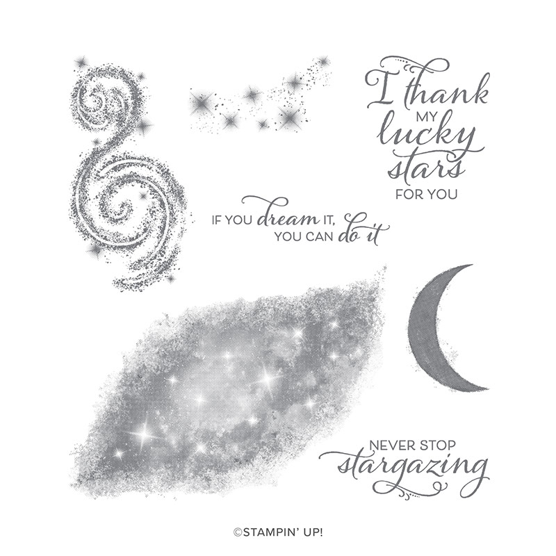
My husband is into astronomy, so when I saw the Stargazing stamp set in Stampin' Up's new catalog I knew it was the perfect set for a Father's Day card for him from me.  To paraphrase Robert Burns, the best laid plans of mice and men...


I ordered the set the morning of June 4th as soon as the catalog went live.  It shipped on June 6th.  On June 8th UPS turned it over to the Postal Service in Sandston, Virginia, the hub for Central Virginia, for an estimated delivery date of June 11th.  Plenty of time to make a card, right?  It was not delivered on the 11th, or the 12th, or the 13th.  That evening the UPS tracker revealed it to be in Myrtle Beach which, if you are not familiar with beaches on the east coast, is two states away in South Carolina!  Maybe it wanted a vacation after the long trip from Utah.  My order finally arrived the day after Father's Day and this weekend I had a chance to play with it.

The original plan was to stamp the nebula/galaxy in dark ink over a watercolored base to let stars show through in pastel colors, use the star cluster stamp to emboss a few stars in white over top, and finish it with that perfect sentiment.  I began by watercoloring on the smooth side of Ranger watercolor paper.  Now watercolor is an exercise of letting go as the water will move color where it wants to and changes it as it dries.  This is what I ended up with.  I apologize that I did not think to photograph it before I started trimming cutting it up.


I was working with this Freshly Made Sketch and thought the darker bleeding purple parts would make a good stripe.


I wanted to cover the whole center panel with the galaxy stamp which meant I would have to make multiple images and blend them.  Plus, I did not really want to have that center section of the stamp be so light.  After practicing on cardstock I decided the best bet would be to pounce ink on using a small thin Life Changing brush.  I used the same technique to color narrow strips of the watercolored paper.  Next I tested the star cluster stamp with Gina K fine detail white embossing powder on my galaxy test piece.  I am glad I did because no matter how fine a powder you use, Stampin' Up's DistINKtive stamps do not translate well with embossing.  Next I sprayed on some Perfect Pearls mixed with water to make the galaxy shimmer.  Note to self:  watercolor paper is not cardstock!  Although the spray worked well on my test piece, it did cause some running of the Night of Navy ink on the watercolor paper, softening the stars.  Then again, if you have ever looked though a high powered telescope on a hot, humid night there is some softening of the image, even when there is no condensation on the lens.

I heat embossed the sentiment on paper from DCWV's Weathered paper stack, cut it out with a thin die, pressed the edges into the Night of Navy ink pad, and attached it with foam tape.  A few sparkles finished the card off.  Whew!  I am also entering this card in the Watercooler Wednesday Challenge to make a masculine card and the Happy Little Stampers watercolor challenge.

Thank you for stopping by!  Until next time, Hansi


Monday, June 10, 2019

Wrapped Watercolor Snowflakes


It seems odd to be making Christmas cards while thankful for air conditioning, but making a few throughout the year is the only way I can manage to have enough ready at Christmas.  Having the time to sign, address and mail them in December is another matter, but I digress.  One of my inspirations to make Christmas cards in the off season is to play Christmas challenges such as the Christmas at Sweet Stampin's  challenge which this month is to use snowflakes.  I am combining this theme with Stamping Sensations' challenge to "show your true colors" with bright, bold, beautiful colors and Happy Little Stampers watercolor challenge.  Now bright and bold is not what I usually think of when using watercolors, but I tried a technique Jennifer McGuire calls wrapped watercolor where you use watercolors to paint a wet, heavy layer of color onto watercolor paper, cover it with wadded up plastic wrap, weigh it down (I used a cutting board with my skillet on top), and wait patiently for it to dry naturally.  It took mine overnight.  Let's just say this is not a technique to use if you need a card in a hurry.  You can see the technique in action by clicking on the link above.

Once my card was completely dry, I sponged Chipped Sapphire Distress Ink around the edges and used Stamper's Anonymous Tim Holtz Swirly Snowflakes and Mini Swirly Snowflakes stamps to heat emboss snowflakes in white.  The Merry Christmas sentiment comes from an old Close to My Heart set.  I used Navy Blue Nuvo Crystal Drops in the centers of the snowflakes and attached the panel to a white card base with craft foam for dimension.

Another card ready for Christmas!  Thank you for stopping by!  Until next time, Hansi

Tuesday, October 31, 2017

A Wreath for the Christmas Card Challenge #24


This card is a just under the wire entry into the Christmas Card Challenge #24 to use this photo as inspiration:


I started with a stamp from Tim Holtz's Mini Christmas Doodle set and used masking to stamp the wreath using Gathered Twigs Distress Ink and the sentiment with Vesamark ink so I could heat emboss it in gold.  Next I colored over the wreath with Prismacolor pencils.  I cut it out  using what I think is an old Nestabilities die and inked the edges with Close to My Heart Desert Sand ink.

I made the background using the wrapped watercolor technique in which you apply layers watercolor until the color is fairly saturated and the water puddling on the paper.  You then cover it with crumpled plastic wrap and weigh it down until it dries.  You can see the technique in action in this Jennifer McGuire video.  I trimmed the dry background and inked the edges with Close to My heart's Olive ink  The center strip was cut from Cranberry paper and inked heavily with Tulip to give it and aged look.  The wreath panel was attached using foam tape.

Thank you for stopping by!  Until next time, Hansi

Materials used:
Paper:  Strathmore cold press watercolor paper, Close to My Heart Cranberry and Colonial White cardstock
Ink:  Gathered Twigs Distress Ink by Ranger, Desert Sand, Olive, and Tulip ink by Close to My Heart,  Versamark
Stamp:  Mini Christmas Doodles Tim Holtz Collection by Stampers Anonymous
Other:  Gold Embossing powder,  assorted green Gansai Tambi watercolors by Kuretake, Prismacolor pencils, Nestabilities (I think) die

Monday, May 8, 2017

Freshly Made with ZIG Clean Color Real Brush markers


I have been seeing a lot about ZIG Clean Color Real Brush markers and had a birthday check to spend so...  Here is my first attempt with them using Altenew's Persian Motifs stamp set and this Freshly Made Sketch:


Yes, the tip really is a brush and they can be used like watercolors.  I made life a little easier by embossing the image which helped me stay within the lines.  The panel is popped up with a sheet of craft foam and the sentiment with foam tape.  Here is the inside:


Thank you for stopping by!  Until next time, Hansi

Materials used:
Paper:  Strathmore watercolor paper, Colonial White, Thistle, and Fern cardstock from Close to My Heart
Stamps:  Persian Motifs and Beautiful Day by Altenew, Holiday Tags by Close to My Heart
Ink:  ZIG Clean Color Real Brush markers, Fern from Close to My Heark, Versamark
Embellishments:  Princess Gold by Ranger and PEARLusture Rubellitte by Stampenous embossing powders

Monday, February 22, 2016

Freshly Made Sunrise


I have needed way too many "thinking of / praying for you" cards lately!  This time I needed one for a man.  Since lighthouses are usually a safe bet for guy cards, I broke out Close to My Heart's Seaside Greetings stamp set and, following this Freshly Made Sketch, began stamping.


I masked off the fence and water portion of the lighthouse stamp before inking it with Cocoa ink because I thought it would blend better into the dune and fence stamp.  After I stamped the images I let them sit for a long time, as in overnight, but an hour would have done it.  I wanted to make sure the ink did not bleed when I sponged over it.  I cannot tell you how I sponged the background because I just kept layering different colors until I liked how it looked.  Once I was done I added the sentiment in black.  The scalloped edge, meant to evoke waves, is pPacock and a bit of Seaside (retired) paper.

Thank you for stopping by!  Until next time, Hansi

Materials used, all Close to My Heart unless otherwise noted:
Paper:  Seaside (retired), Colonial White, Desert Sand and Peacock cardstock
Ink:  Cocoa, Black, Desert Sand, Flaxen, Saffron, Sapphire, Peacock, Whisper, Smoothie, Sorbet, and Galcier
Other:  Scallop punch

Thursday, November 19, 2015

A Watercolor Christmas


Don't you just hate it when life interferes with your crafting?  It took me over a week to finish this card for Heart 2 Heart's Wonderful Watercolor challenge!  Now I do have to tell you that watercolors intimidate me, but there is a reason why they are called challenge blogs, so I pulled out my watercolors, a brush, and a cup of water and gave it my best shot.  I have always loved this tree from the Always Grateful stamp set.  To get the snow covered effect, I stamped it first with black ink and then after lightly tapping the stamp on Versamark, stamped it just slightly higher than the first image and embossed with Ranger White Super Fine embossing powder.  To balance all the white on the right side of the card, I used some White Enamel Gems.

Thank you for stopping by!  Now why don't you head on over the Heart 2 Heart Challenges blog for some inspiration and maybe enter the challenge yourself?  We would love to see your work!  Until next time, Hansi

Materials used, all Close to My Heart unless otherwise noted:
Paper:  White Daisy, Outdoor Denim (retired), and Indian Corn Blue (retired) cardstock
Ink:  Indian Corn Blue (retired), Black
Stamps:  Always Grateful, Holly Jolly Christmas
Embellishments:  White Enamel Gems, Ranger White Super Fine embossing powder
Other:  Snowflake folder by Darice

Monday, October 26, 2015

Freshly Made Special Sympathy Card


When a friend lost her beloved dog of many years last week, I knew that I wanted to use this adorable dog from the new Artistry Cricut cartridge to make her a sympathy card.  This Freshly Made Sketch was perfect for what I had in mind.


I started by making a rainbow with my new CTMH watercolors and then added the puppy cutout embellished with an enamel heart.  If you are not familiar with the Rainbow Bridge, here is a link to the comforting poem.  I wanted to keep the emphasis on the image yet give the card some interest and dimension, so I pierced a border and attached the panel to a Colonial White card base with foam tape.

Thank you for stopping by!  Until next time, Hansi

Materials used, all Close to My Heart unless otherwise noted:
Paper:  Colonial White cardstock
Ink:  Black
Stamp:  Big Hug
Embellishment:  Enamel Heart (retired)
Other:  Artistry Cricut Cartridge, Watercolors